Avega Bros. Website Redesign
Redesigning the digital presence of a 40-year Philippine shipping company, 15+ pages, one cohesive experience.
Overview
Avega Bros. is a full-service logistics and shipping company based in the Philippines with over 40 years in the industry. Their fleet of 41 cargo ships, tugboats, barges, and heavy equipment serves domestic shipping routes across the Philippine archipelago. Despite their operational scale, their digital presence didn't reflect the credibility or professionalism of the company. I led the redesign of their entire website, 15+ pages across services, fleet management, careers, and contact, transforming it from a dated, single-page layout into a modern, structured web experience that builds trust with prospective clients and recruits.
Role
Lead Designer, owned the full design process from discovery to handoff, and collaborated closely with the development team on implementation.
Team
Design + Development
Timeline
~2 months
Client
Avega Bros. Integrated Shipping Corporation
Tech Stack
The Problem
The existing Avega Bros. website suffered from several critical issues that undermined the company's credibility with potential clients and job seekers.
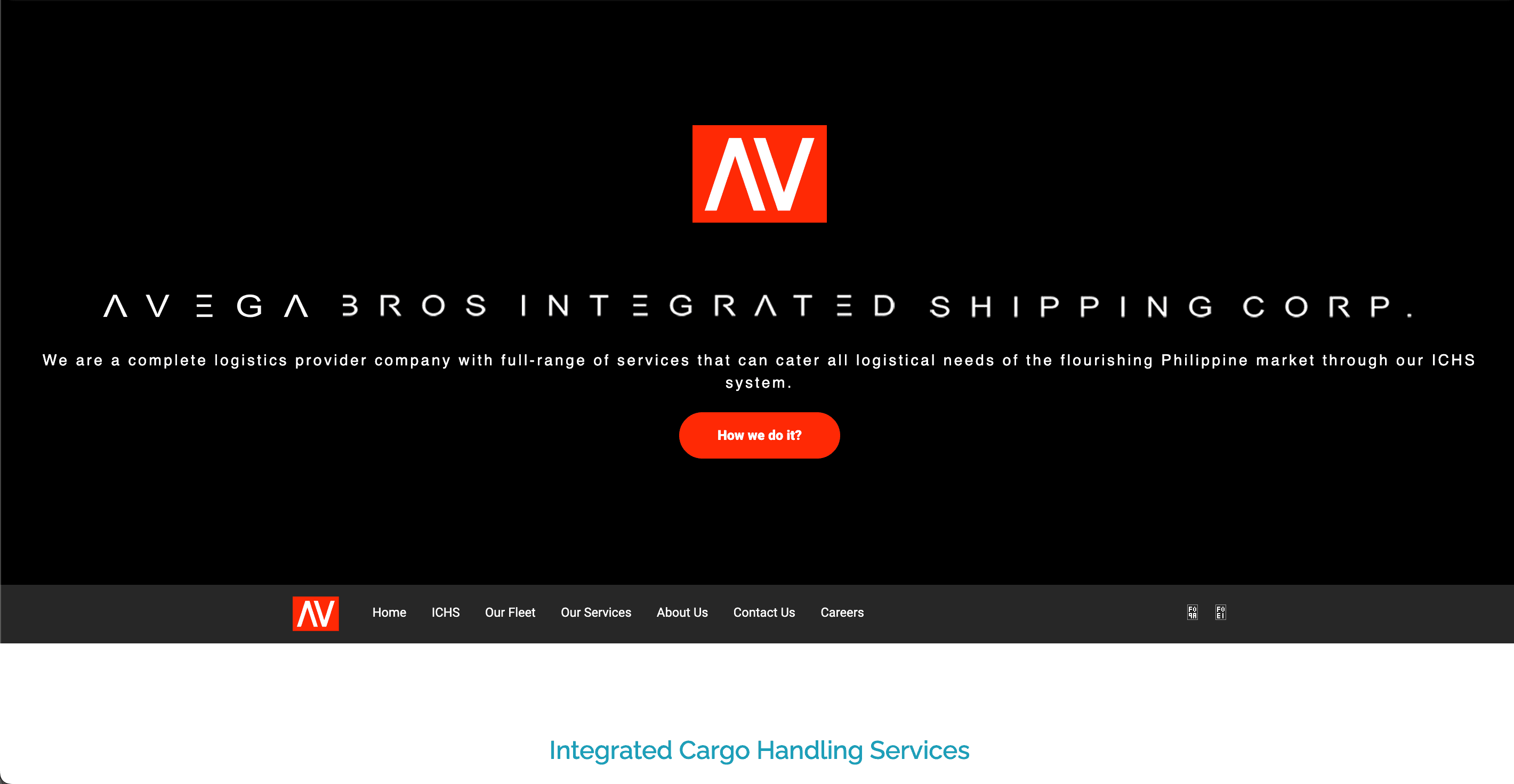
Visual Design
The site felt outdated and inconsistent. The homepage used a rainbow color scheme across its ICHS process section: red, orange, yellow, green, blue, purple, with no cohesive brand palette. Typography varied in size, weight, and style from section to section. Leadership photos were cutouts placed on flat colored backgrounds, giving the page an unpolished, template-like feel.
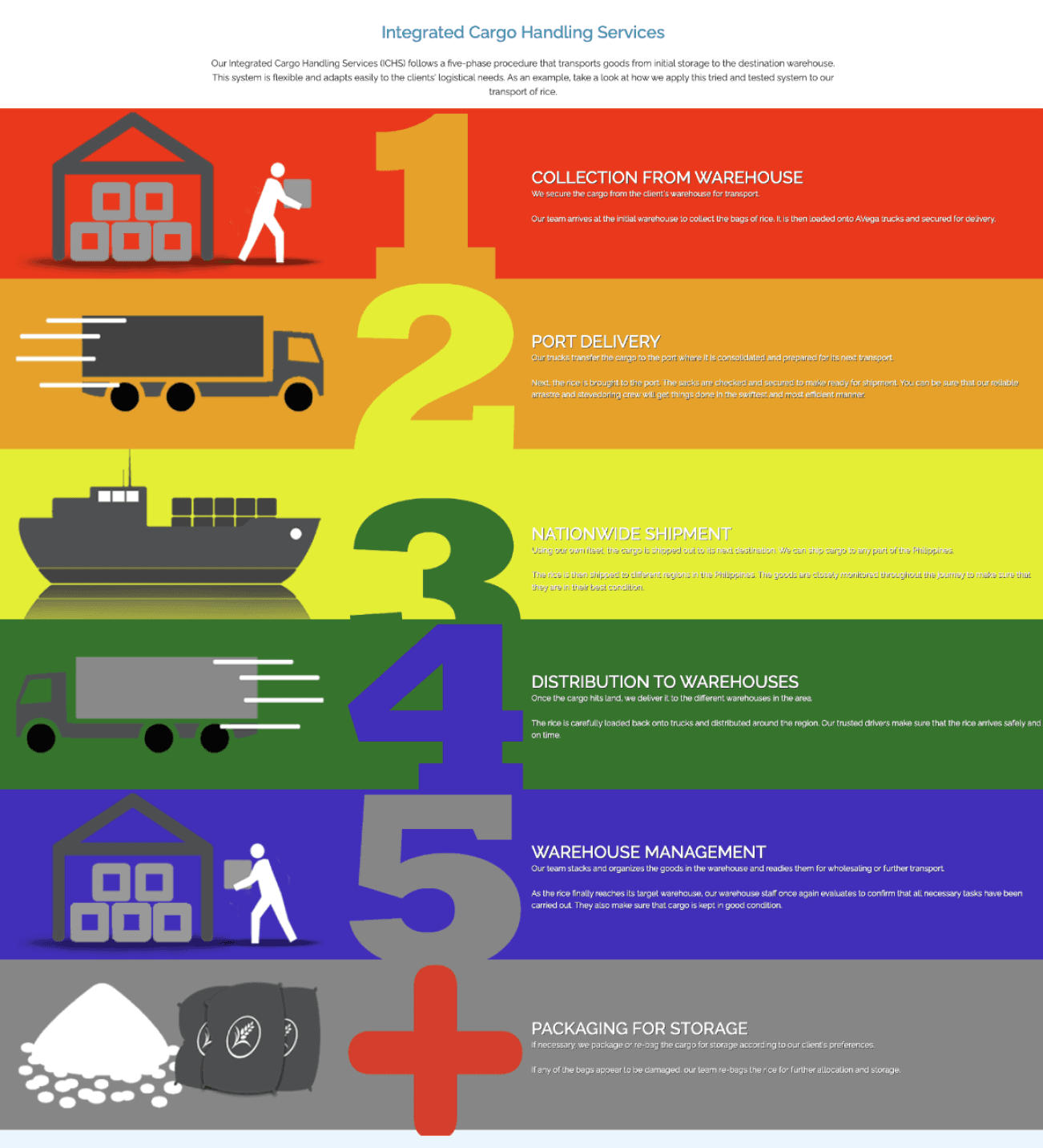
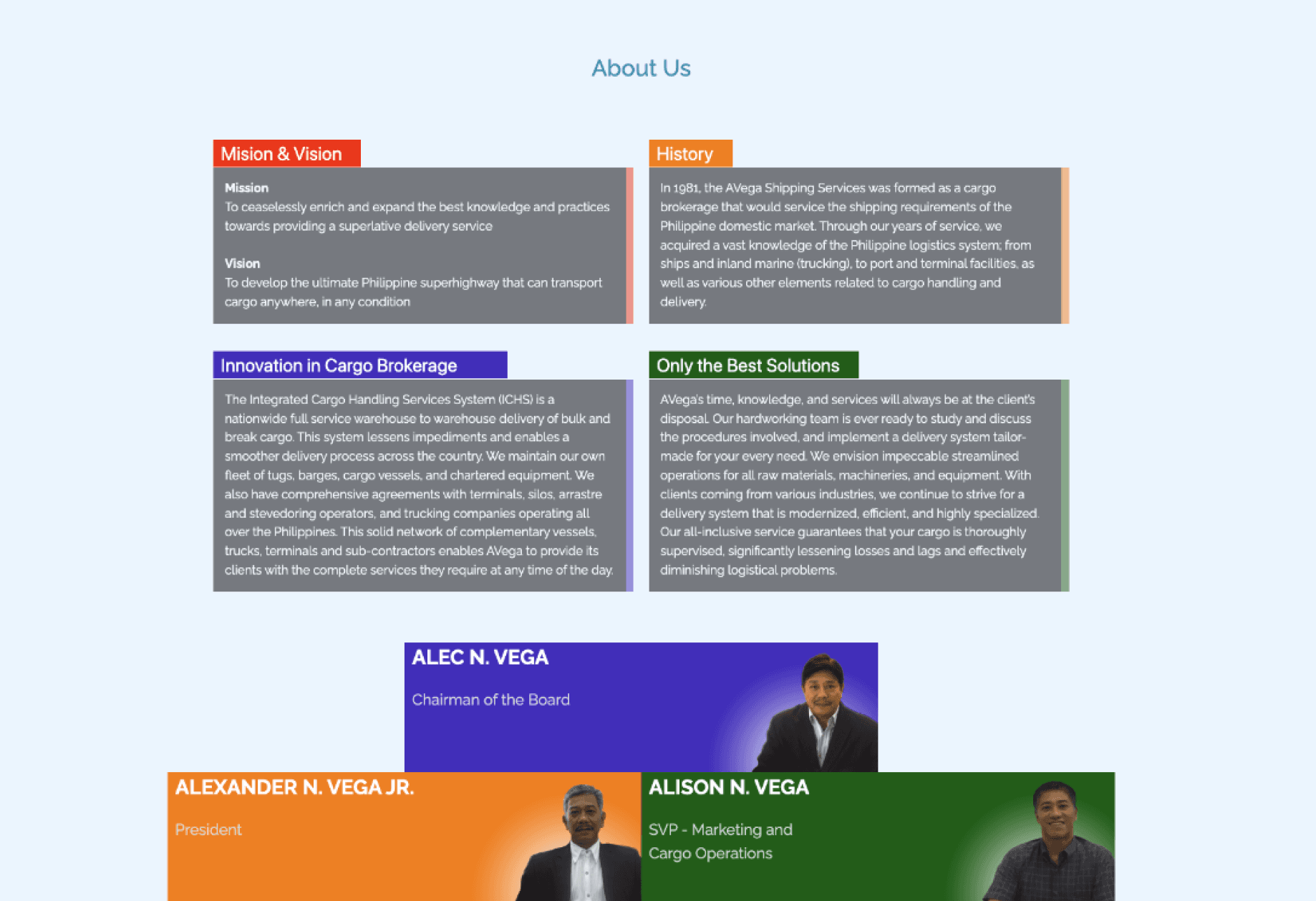
Information Architecture
The information architecture was flat. Nearly all content: services, fleet, about, team bios, and contact details, lived on a single scrolling page. There were no dedicated service pages, no way to explore the fleet in detail, and no structured careers section. A potential client trying to understand the difference between shipping, trucking, and lighterage had to scan through dense paragraph blocks.
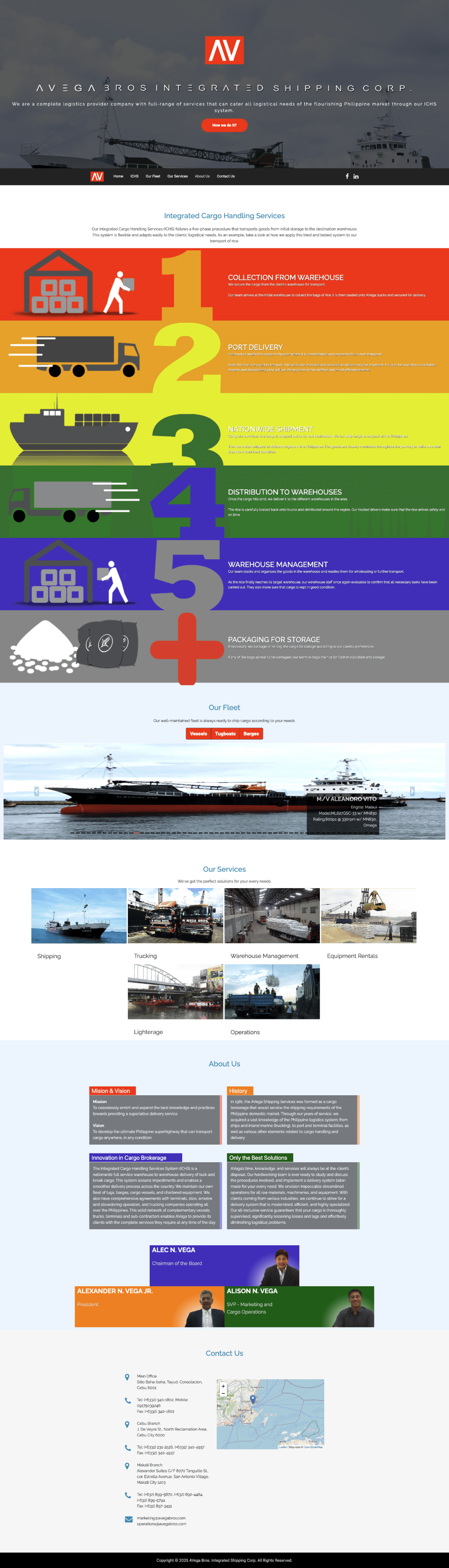
No Clear Conversion Path
There was no clear conversion path. The contact section was raw text at the bottom of the page, no form, no service selector, no way for a prospect to specify what they needed. For a B2B logistics company where lead generation is the website's primary function, this was a significant gap.
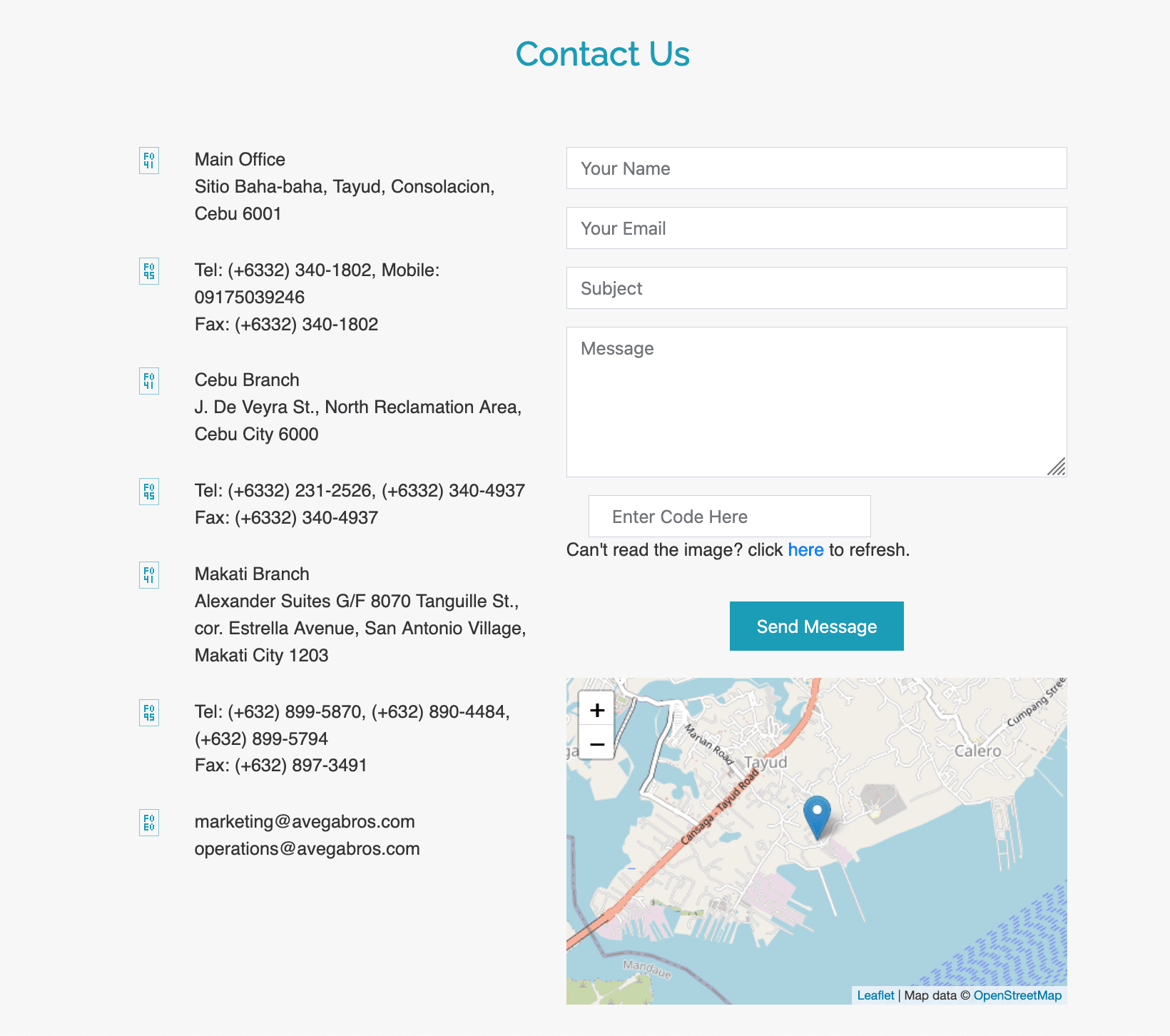
Research & Discovery
As lead designer, I focused the discovery phase on understanding two things: who visits a logistics company's website and what they need to do when they get there.
Stakeholder Interviews
Stakeholder interviews with the Avega team revealed that their primary website visitors fall into three groups: cargo shippers evaluating service providers, potential employees (especially maritime crew), and existing clients checking fleet availability. The old site served none of these audiences well.
Competitive Analysis
Competitive analysis of other Philippine logistics companies and international shipping firms showed a clear pattern: credible players in this space use clean, professional design with prominent fleet catalogs, structured service breakdowns, and easy-to-find contact or quote-request forms. Avega's site was noticeably behind industry standards.
Key Insights
Ideation & Design Decisions
Design System & Visual Identity
I replaced the chaotic rainbow palette with a disciplined system of red (Avega's brand color), white, and dark gray. Red is used sparingly and intentionally — primary CTAs, the logo, accent labels, and active filter states. This restraint gives the brand a confident, maritime-industry-appropriate presence. Typography follows a clear hierarchy: large, bold headings for section titles with clean sans-serif body text for readability.
Information Architecture Overhaul
I restructured the single-page site into a multi-page experience with clear navigation: Home, About, Services (with five sub-pages), Fleet, Careers, Blog, and Contact. Each section has a defined purpose and audience.
Homepage as a Launchpad
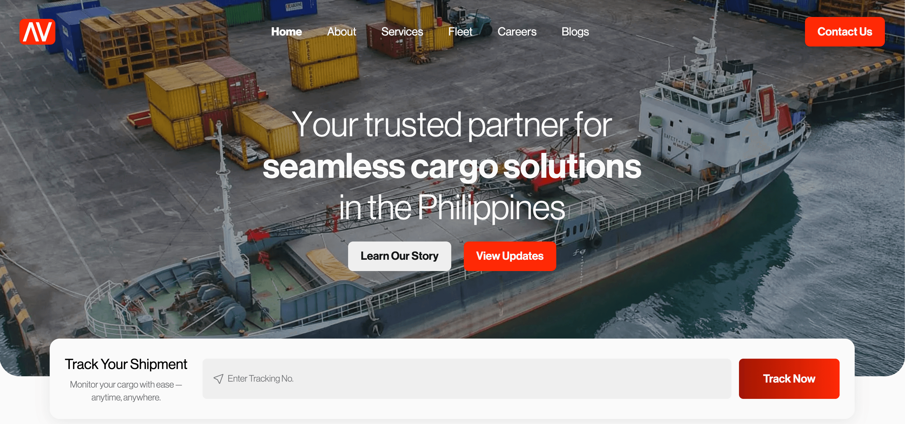
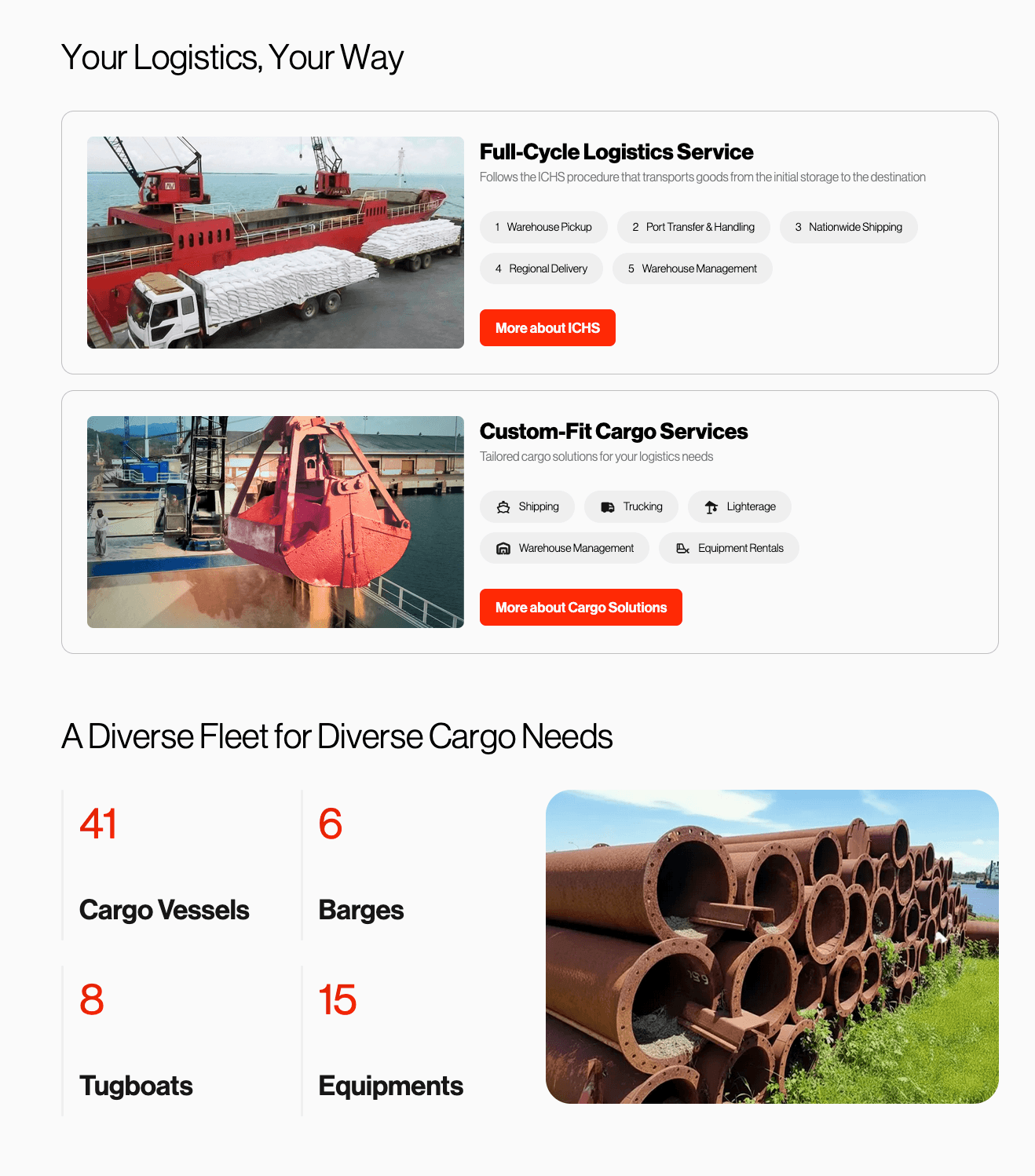
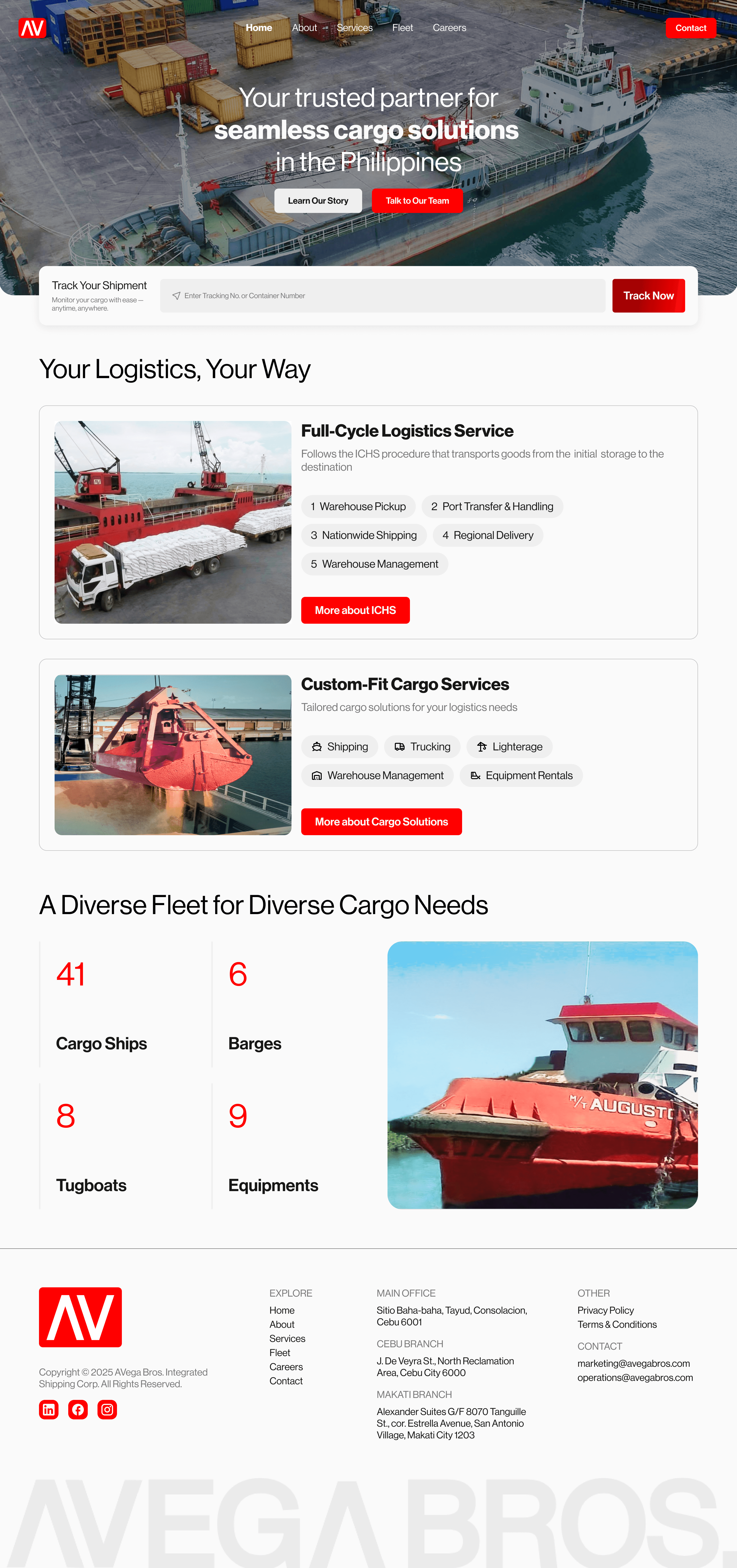
Rather than cramming everything onto one page, the new homepage acts as an entry point. It leads with a strong hero ("Your trusted partner for seamless cargo solutions in the Philippines"), surfaces the shipment tracking tool immediately below the fold, previews both service categories (ICHS and Tailored Cargo) as scannable cards with chip-style tags, and closes with fleet stats to establish scale at a glance.
Homepage structure
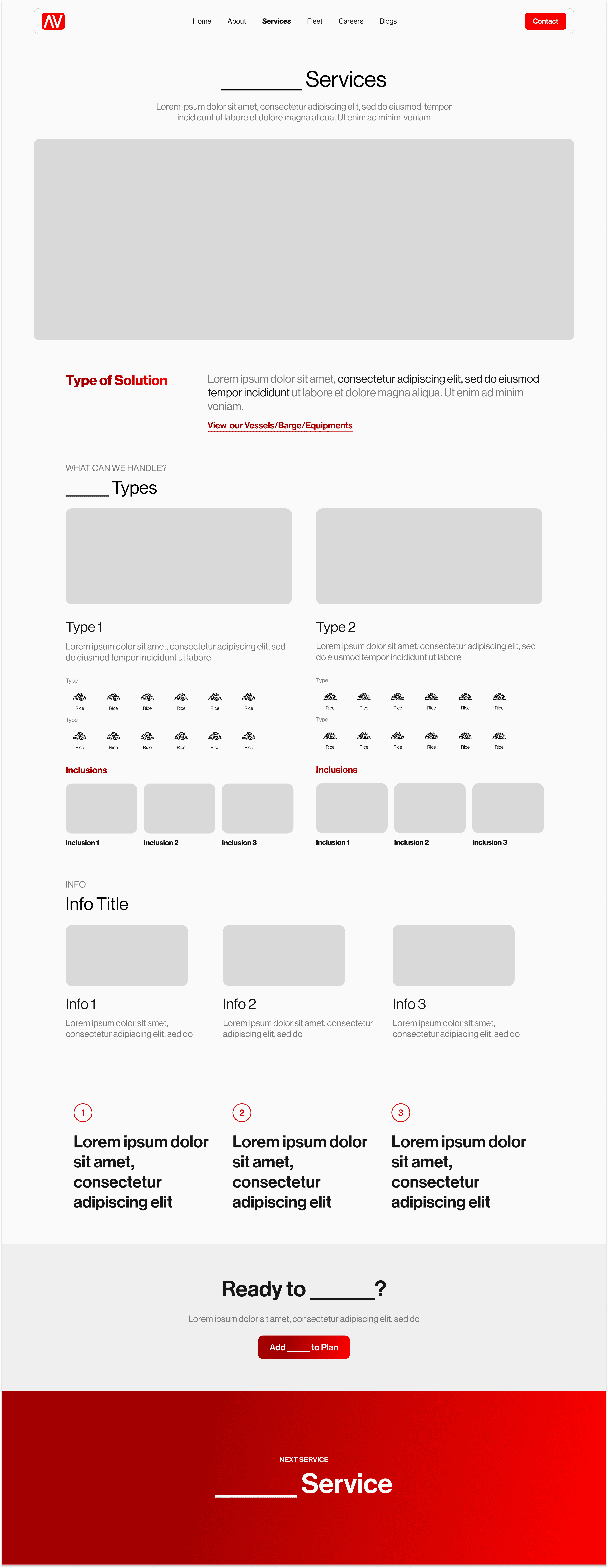
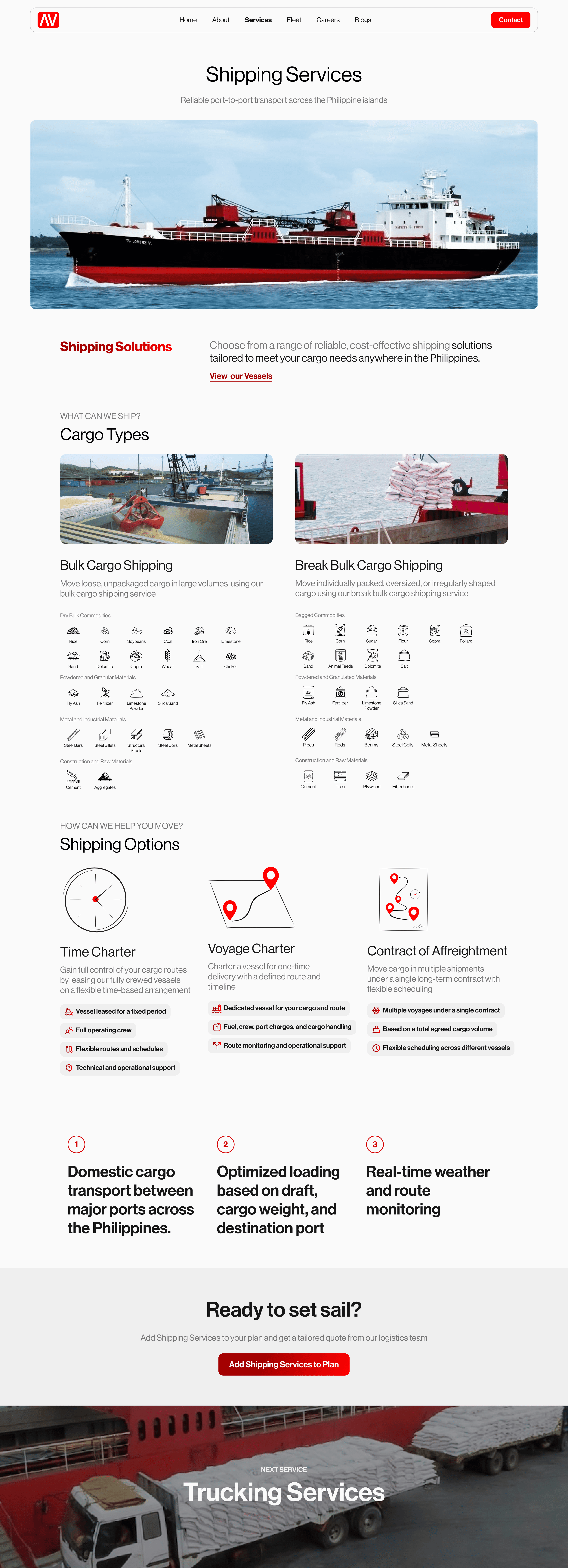
Service Page Template System
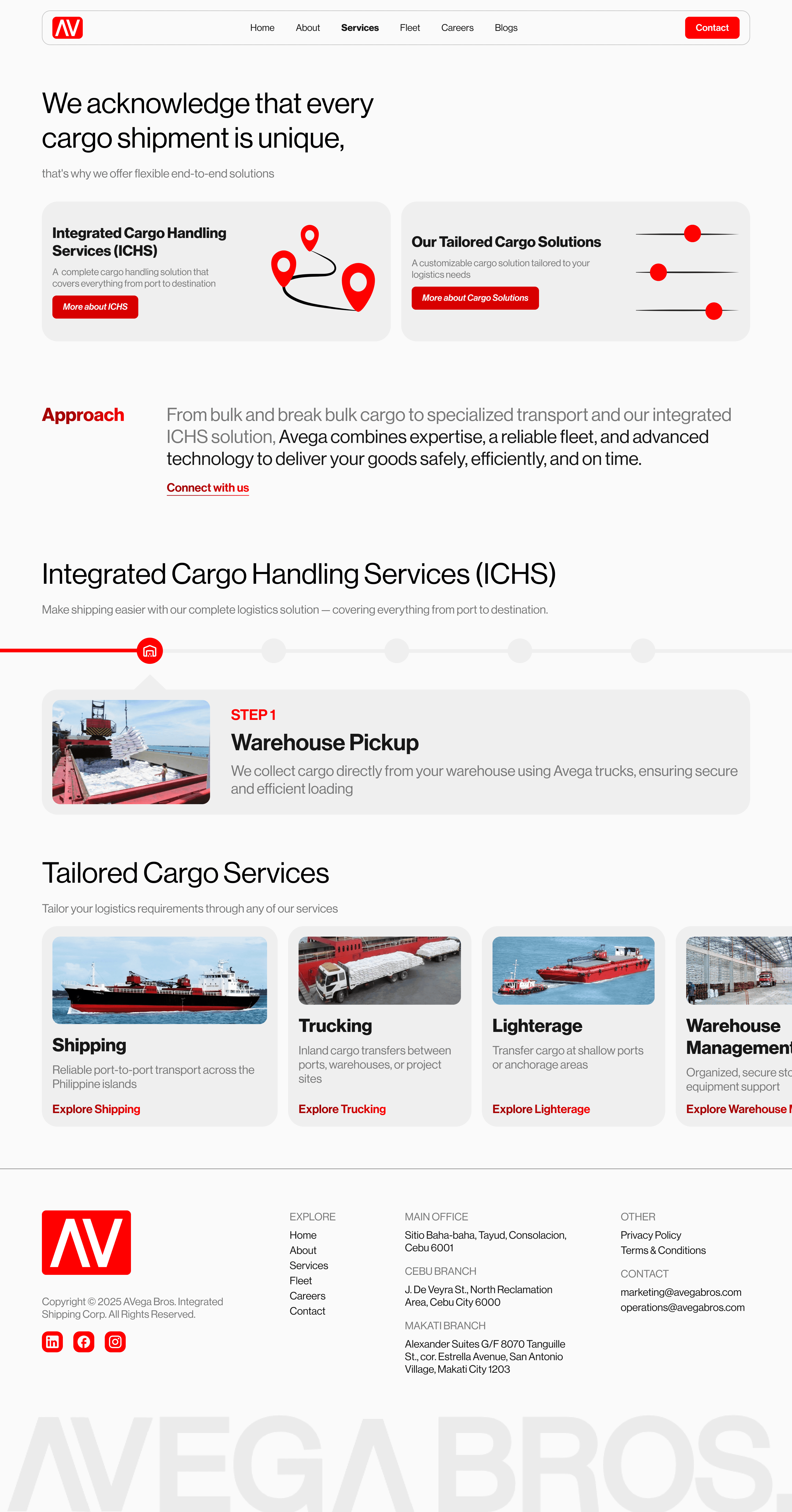
I designed a repeatable template that each service sub-page follows, giving users a consistent mental model while keeping each page self-contained.
Fleet Catalog with Filtering
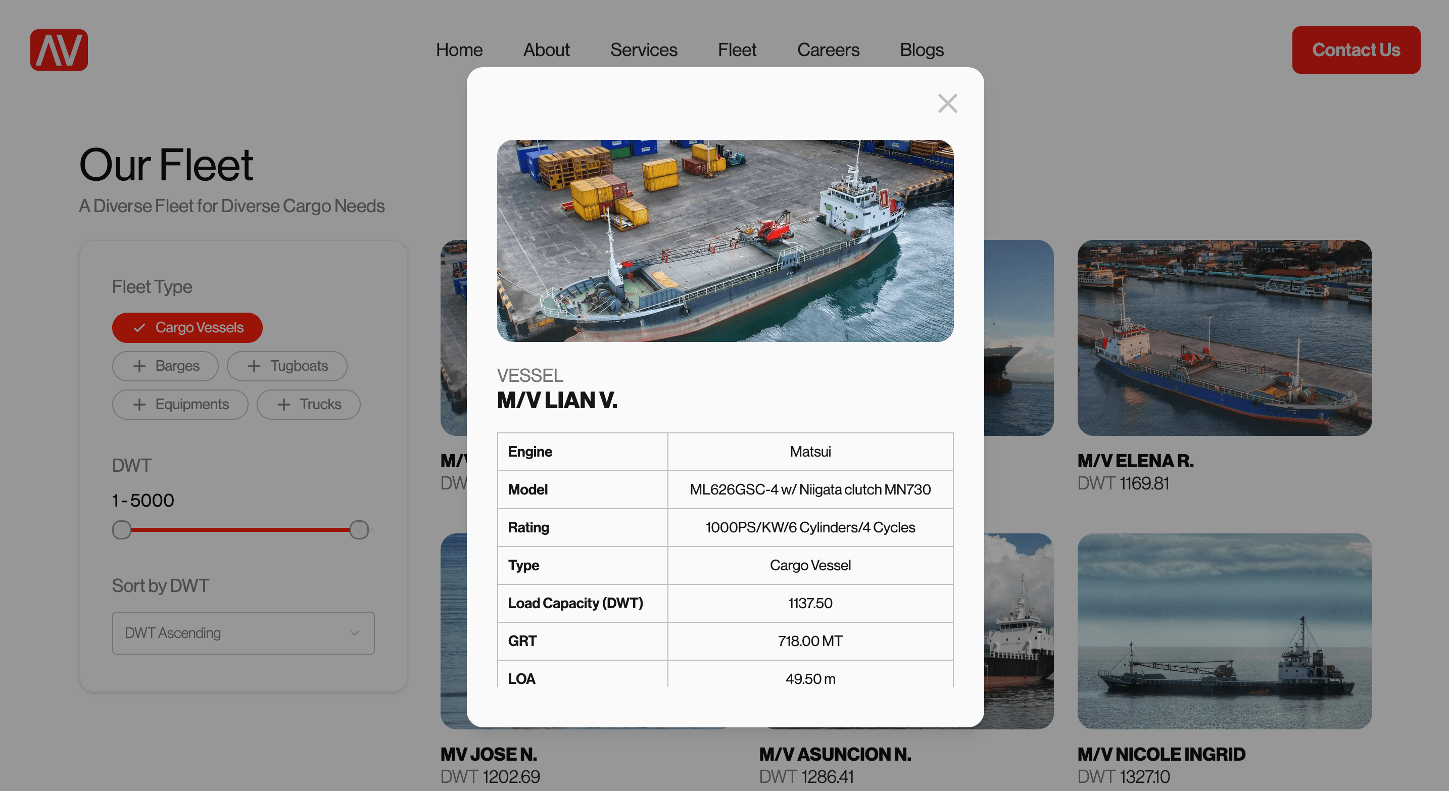
The old site showed a single vessel in a static carousel. The new fleet page is a filterable catalog where users toggle between Cargo Vessels, Trucks, Tugboats, Barges, and Equipment. A capacity slider lets them filter by GRT range, and clicking any asset opens a detail modal with full specifications (engine, model, load capacity, dimensions). This turns the fleet page from a brochure into a functional tool.
Fleet Type
DWT
1 – 5,000
Sort by DWT
Contact Form as a Conversion Engine
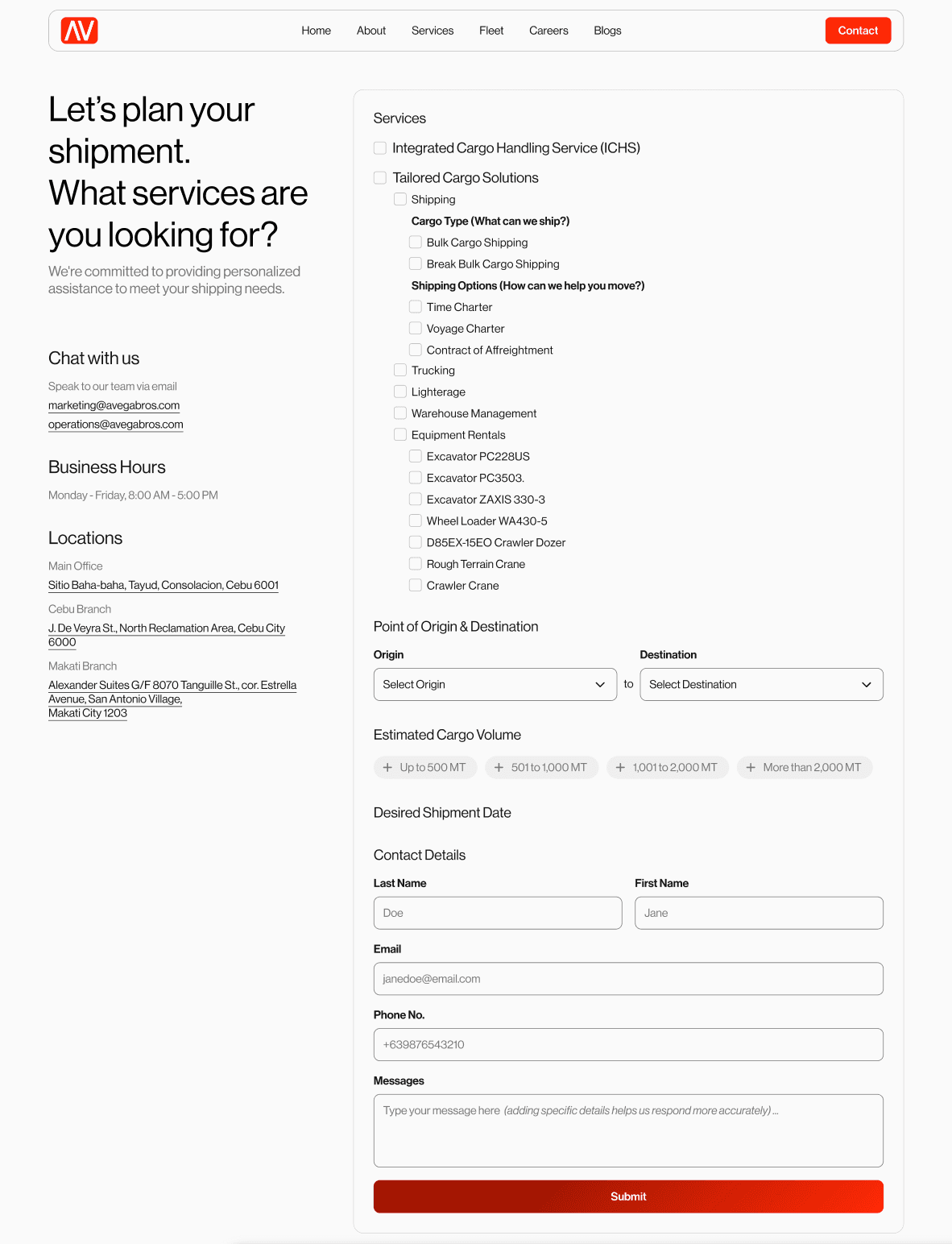
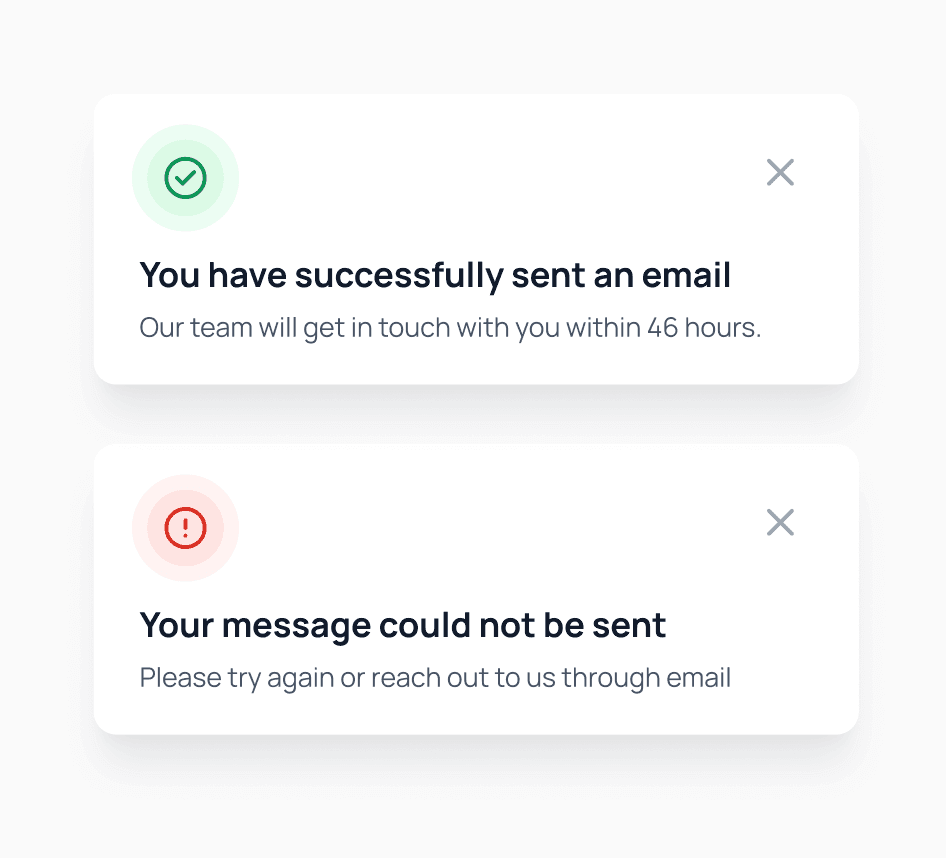
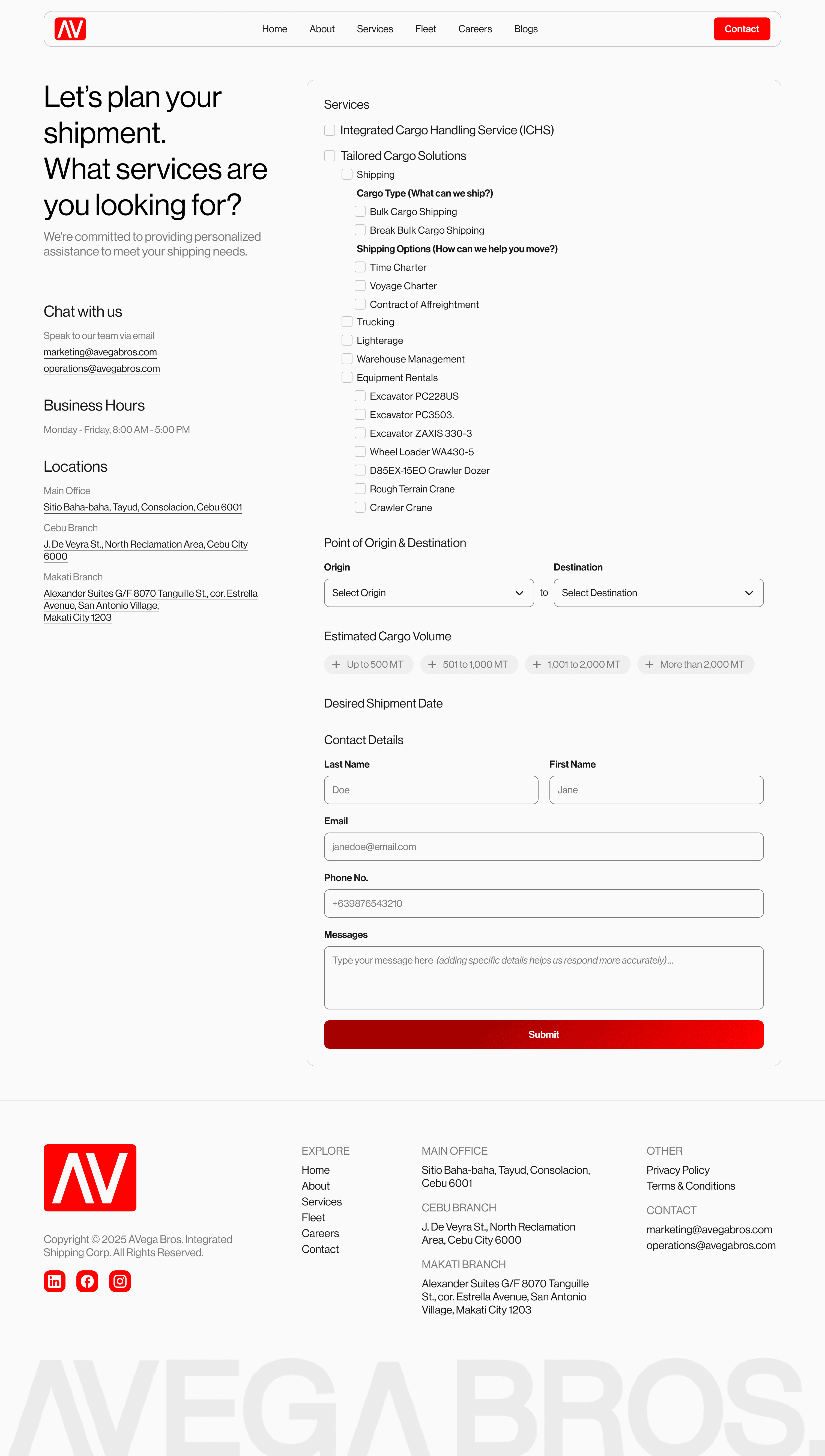
The old site had no form at all. The new contact page opens with "Let's plan your shipment. What services are you looking for?" and presents a structured form: service selection (checkboxes for ICHS, shipping, trucking, etc.), cargo type, shipping options, origin/destination dropdowns, estimated cargo volume (chip-select from "Up to 500 MT" to "More than 2,000 MT"), desired shipment date, and contact details. Both error and success toast states handle submission feedback gracefully.
Careers as a Job Board
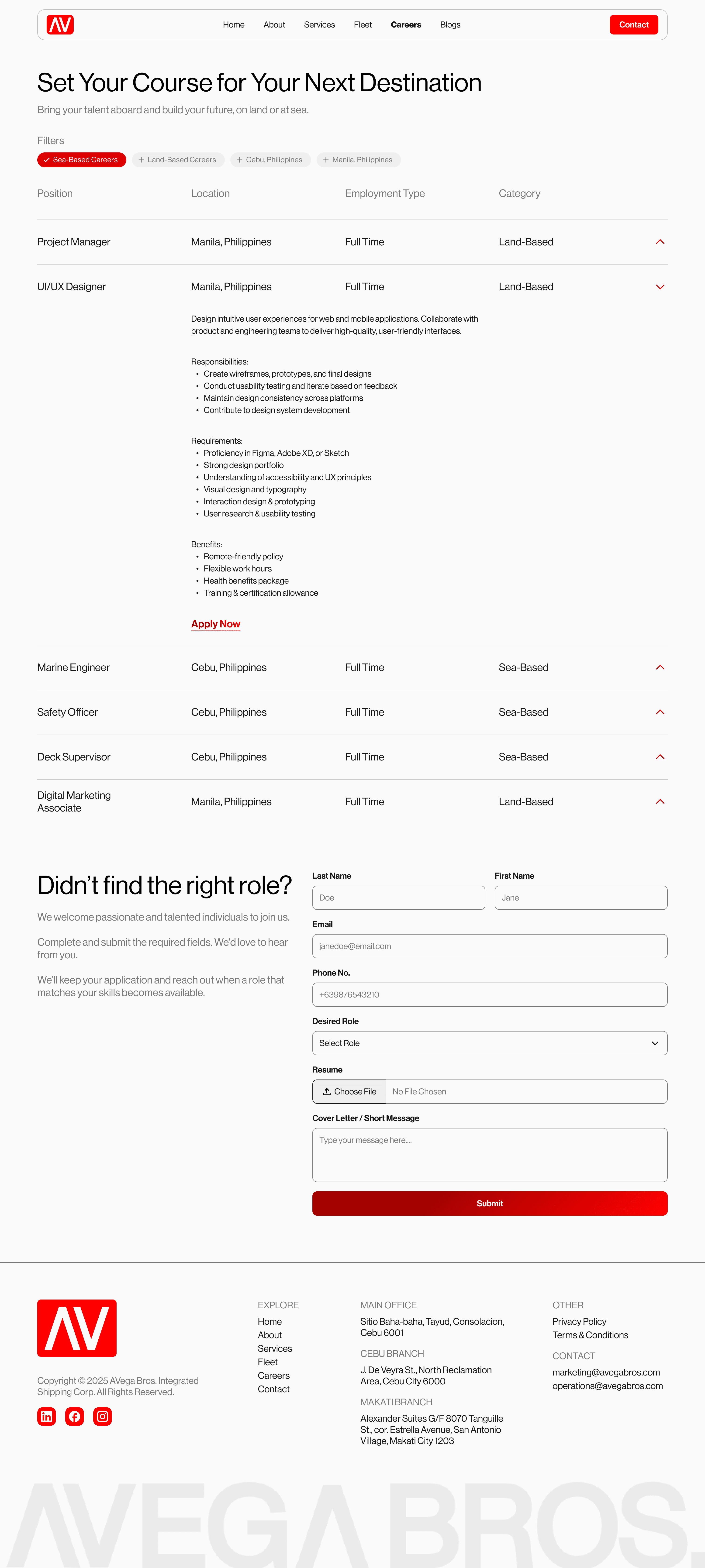
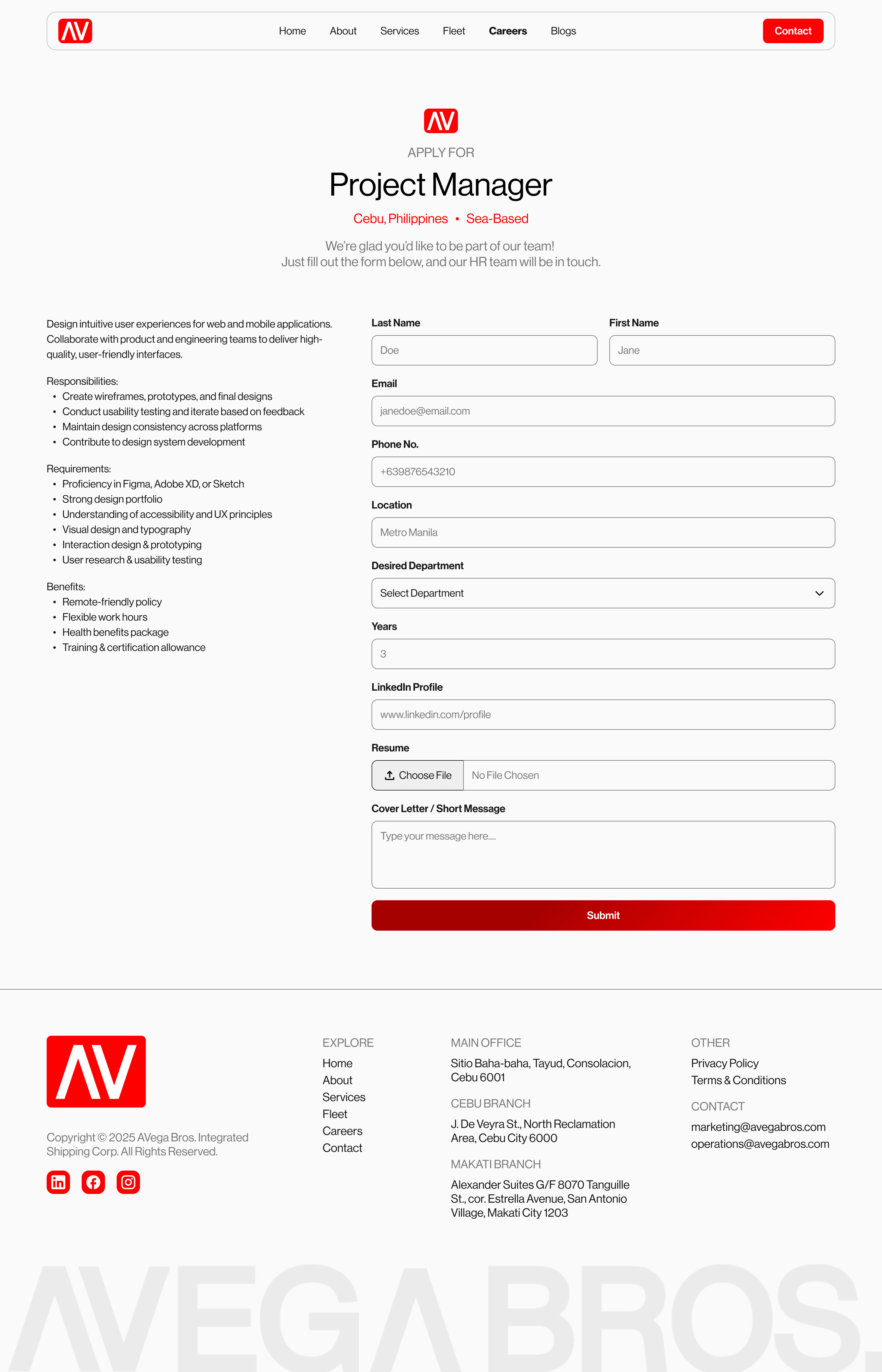
The careers page went from nonexistent to a full job board with filterable listings (sea-based vs. land-based, by location), expandable role details showing responsibilities, requirements, and benefits, and dedicated application pages with resume upload. A "Didn't find the right role?" section at the bottom captures speculative applications.
About Page Storytelling
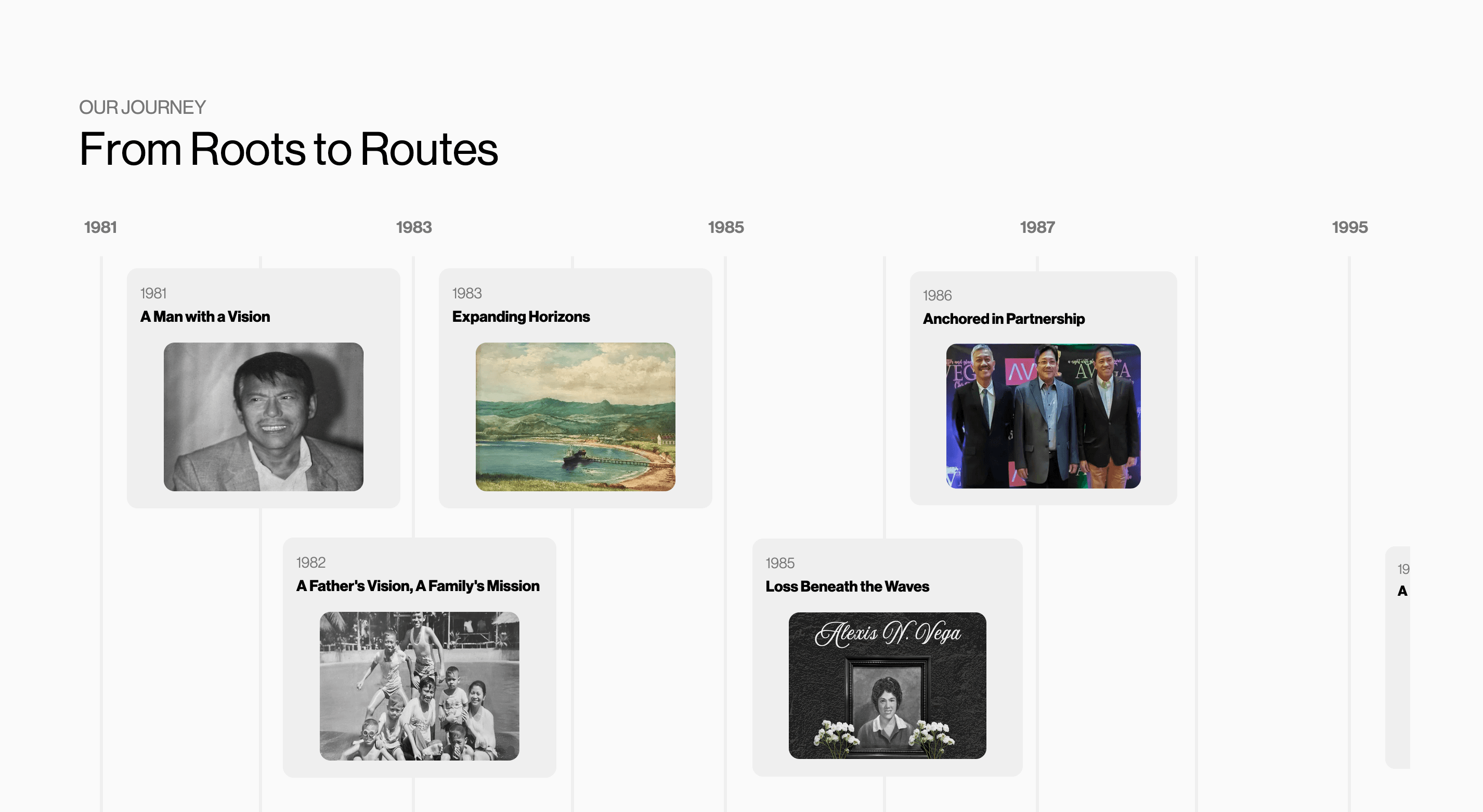
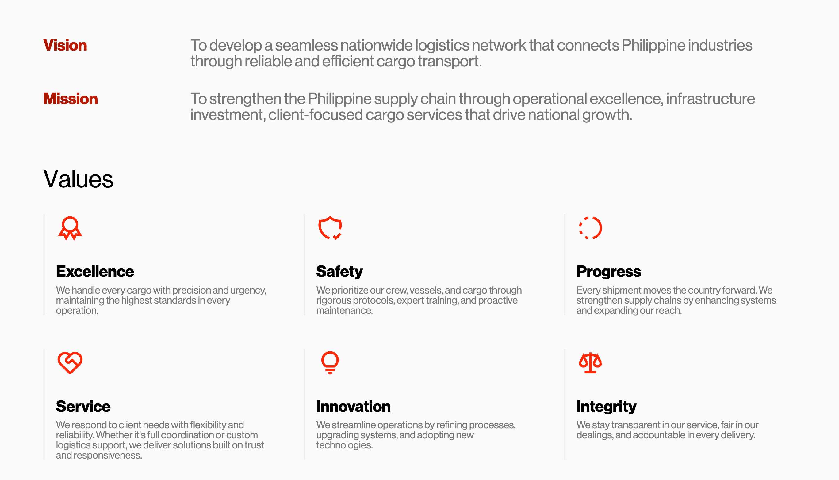
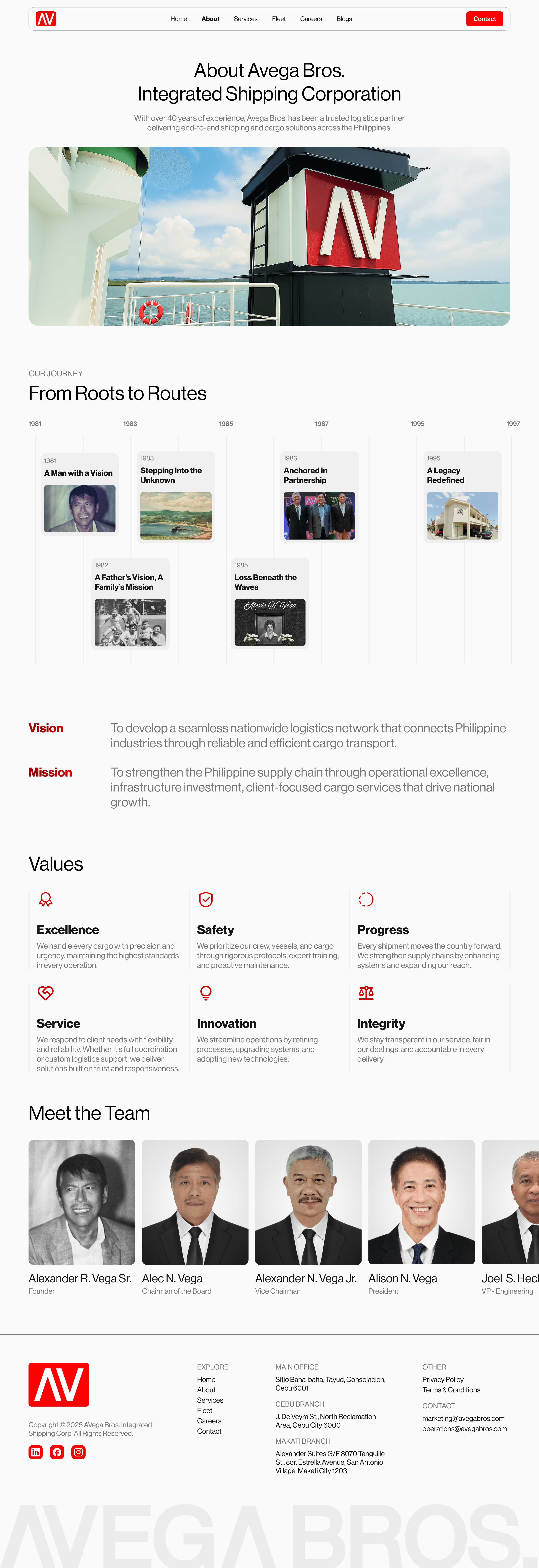
The new About page uses a "From Roots to Routes" timeline to tell Avega's 40+ year history visually, followed by Vision/Mission statements, a six-value grid (Excellence, Safety, Progress, Service, Innovation, Integrity) with custom icons, and professional team portraits. The blog section at the bottom surfaces company updates and industry content.
Final Design & Handoff
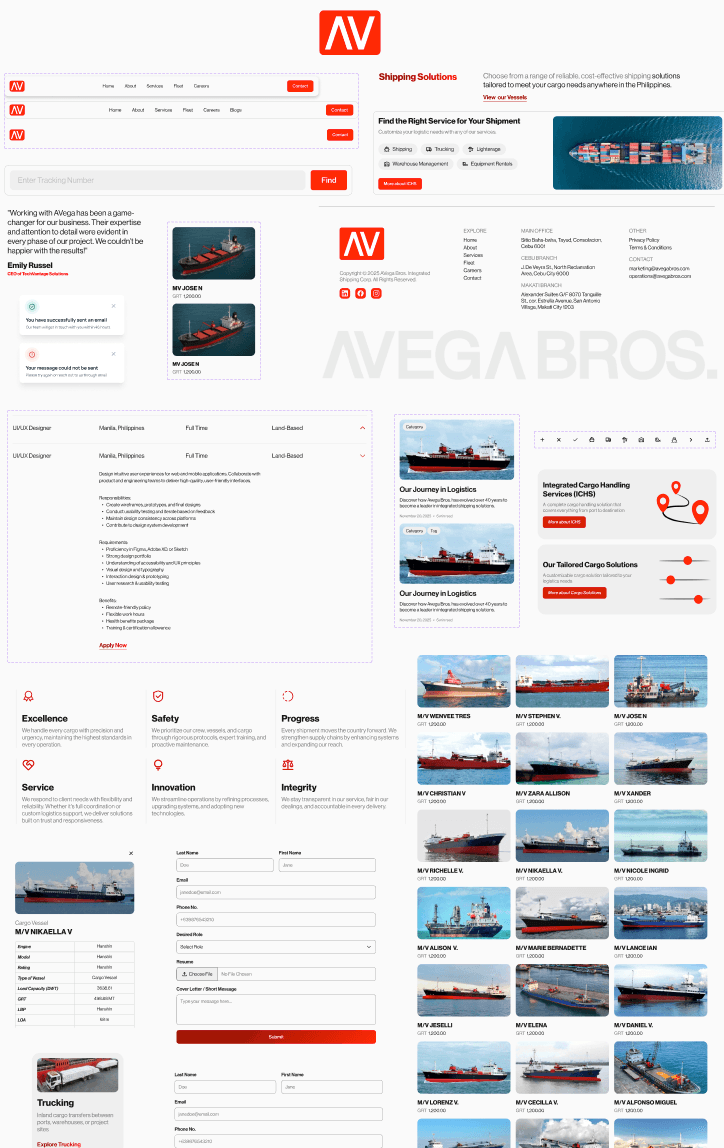
The final delivery included 15+ unique page designs in Figma covering every section of the site, a component library with reusable cards, buttons, form elements, navigation, footer, and icon sets, responsive considerations for the full layout system, and interactive states for filters, modals, form validation, and toast notifications. The designs were handed off to the development team for implementation in Next.js.
Deliverables
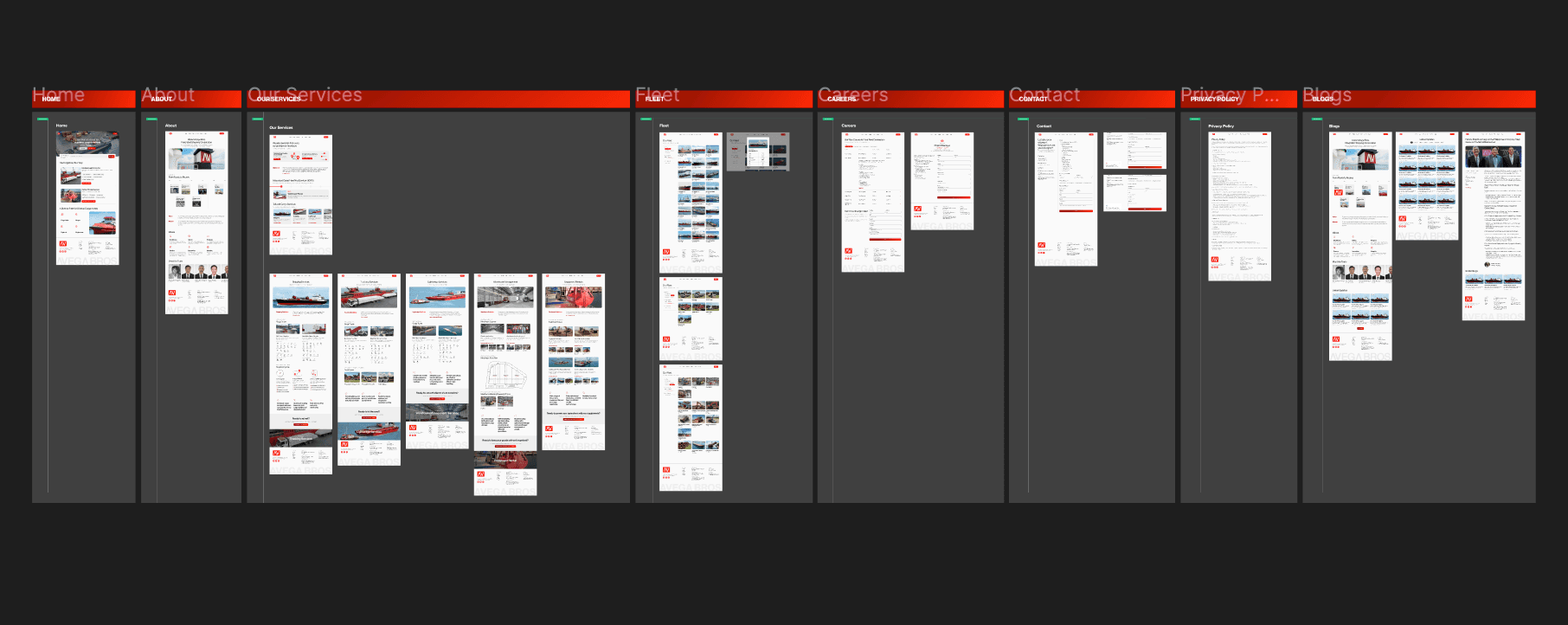
Key Screens

Component Library
Results & Impact
This project is recently launched, so quantitative metrics are still being collected. However, the redesign delivered several measurable improvements to the user experience.
Retrospective
If I were to revisit this project, I'd push for user testing with actual cargo shippers to validate the contact form's field structure — the current form captures a lot of information upfront, and there's a question of whether that creates friction or actually helps Avega's sales team respond faster.
I'd also explore adding a shipment tracking dashboard beyond the simple tracking input on the homepage, since that's a key touchpoint for existing clients.