Athletica: Designing a Social Gym Booking App from 0 → 1
Building a social fitness product from concept to dev-ready in under a month.
Overview
A fitness startup had a clear vision: build a gym booking app centered on social accountability, but no design direction. No wireframes, no flows, no UI system. In 3 to 4 weeks, our team of 2 to 3 designers took Athletica from concept to a fully designed, dev-ready mobile app.
Role
UX Researcher & Designer
Team
2 - 3 designers (design internship)
Timeline
3 - 4 weeks
Tech Stack
FigmaFigJam
The Problem
Most people know they should go to the gym. The hard part is actually showing up consistently.
Research shows that people who work out with a friend are significantly more likely to stick with their routine. Yet most gym and fitness apps treat exercise as a solo activity. They'll track your reps or suggest a workout plan, but they don't address the biggest barrier to consistency: accountability.
The existing landscape, apps like Nike Training Club, ClassPass, and Gymbuddy, each solve a piece of the puzzle. Nike Training Club offers guided workouts but no social booking. ClassPass handles discovery and scheduling but treats each booking as an individual transaction. Gymbuddy connects workout partners but doesn't handle the logistics of actually getting to a gym together.
None of them answer the simple question: "Want to hit the gym with me on Thursday?" Athletica needed to close that gap.
Research & Discovery
We analyzed three key competitors to identify gaps and opportunities, then mapped a clear whitespace in the market.
Competitive Analysis
01
Nike Training ClubStrong workout content library and guided video sessions, but no social features or gym booking functionality. Users trained alone by default.
02
ClassPassSolved discovery and scheduling well, with a wide network of studios and flexible credits. However, every booking was a solo transaction, no way to coordinate with friends or split costs.
03
Gymbuddy / HevyIntroduced social elements like workout logging and friend feeds, but lacked the logistical layer. You could see what your friend lifted, but you couldn't book a session together or manage shared payments.
Workout Content
Gym Booking
Friend Invitations
Payment Splitting
Social Feed
Nike Training Club
✓
—
—
—
—
ClassPass
—
✓
—
—
—
Gymbuddy / Hevy
—
—
—
—
✓
Athletica
✓
✓
✓
✓
—
Key Insight
The market had a clear whitespace: no app combined gym discovery, session booking, friend invitations, and payment splitting into one seamless flow. Social fitness existed as a feature bolt-on, never as the core product architecture.
Navigating Ambiguity
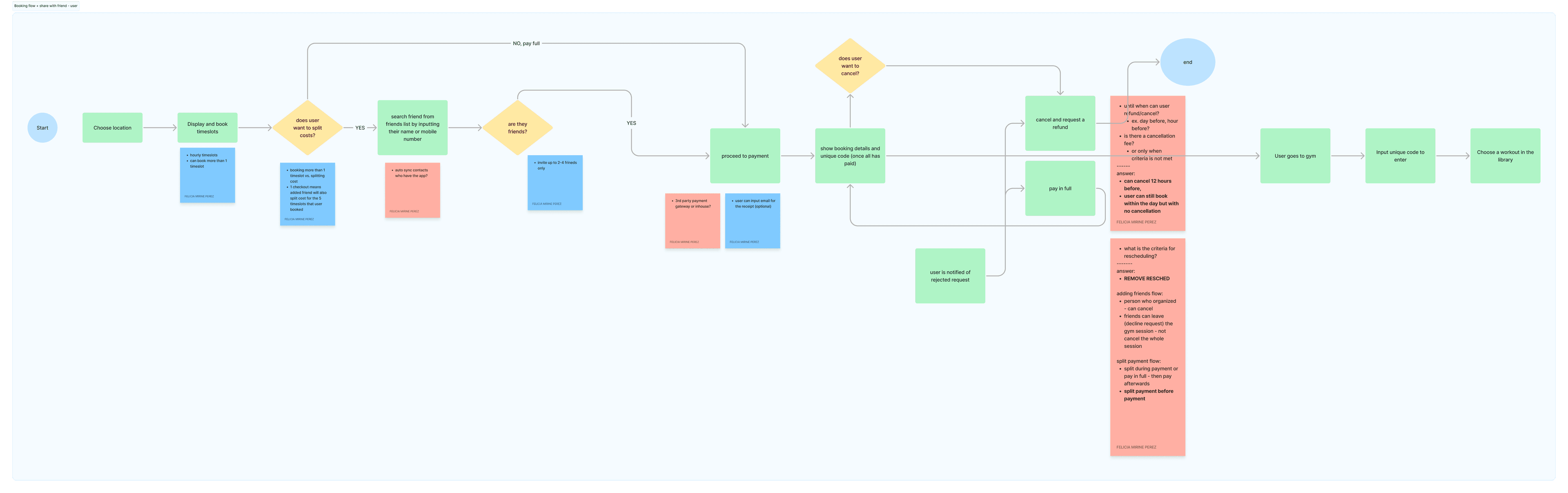
The client came to us with a vision but not a specification. We documented open questions directly on our user flows as annotation cards, turning ambiguity into visible design decisions rather than hidden assumptions.
—Is the workout library free, or locked until the user makes their first booking?
—Should friend profiles be public or private? What about fitness levels, always visible, or opt-in?
—How do we handle the case where an invited friend doesn't have the app yet?
—What happens when a friend declines, does the host pay the full amount, or can they cancel?
—What's the maximum number of friends per booking? Does the pricing model scale?
—Who is the target market, locals or travelers? (The client was initially targeting Bali, Indonesia with 10 to 15 gym locations for MVP.)
Ideation & User Flows
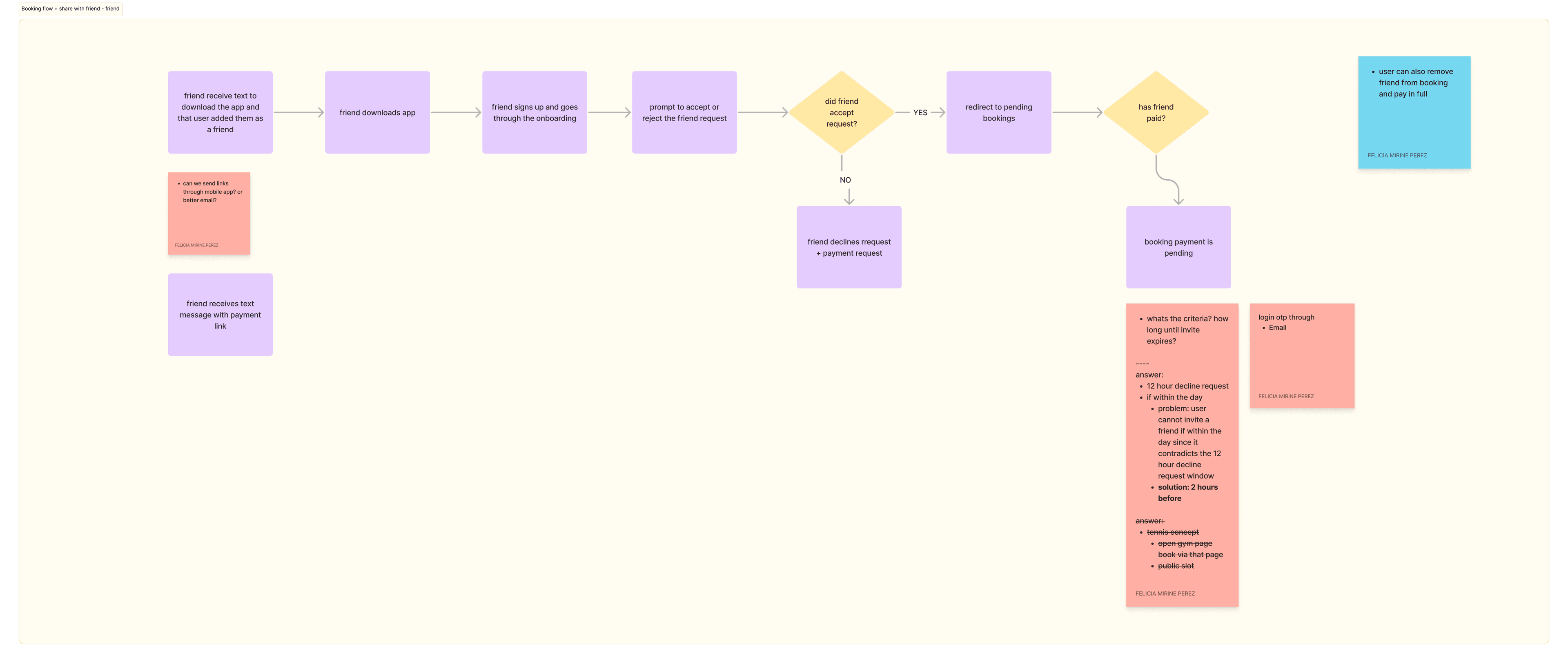
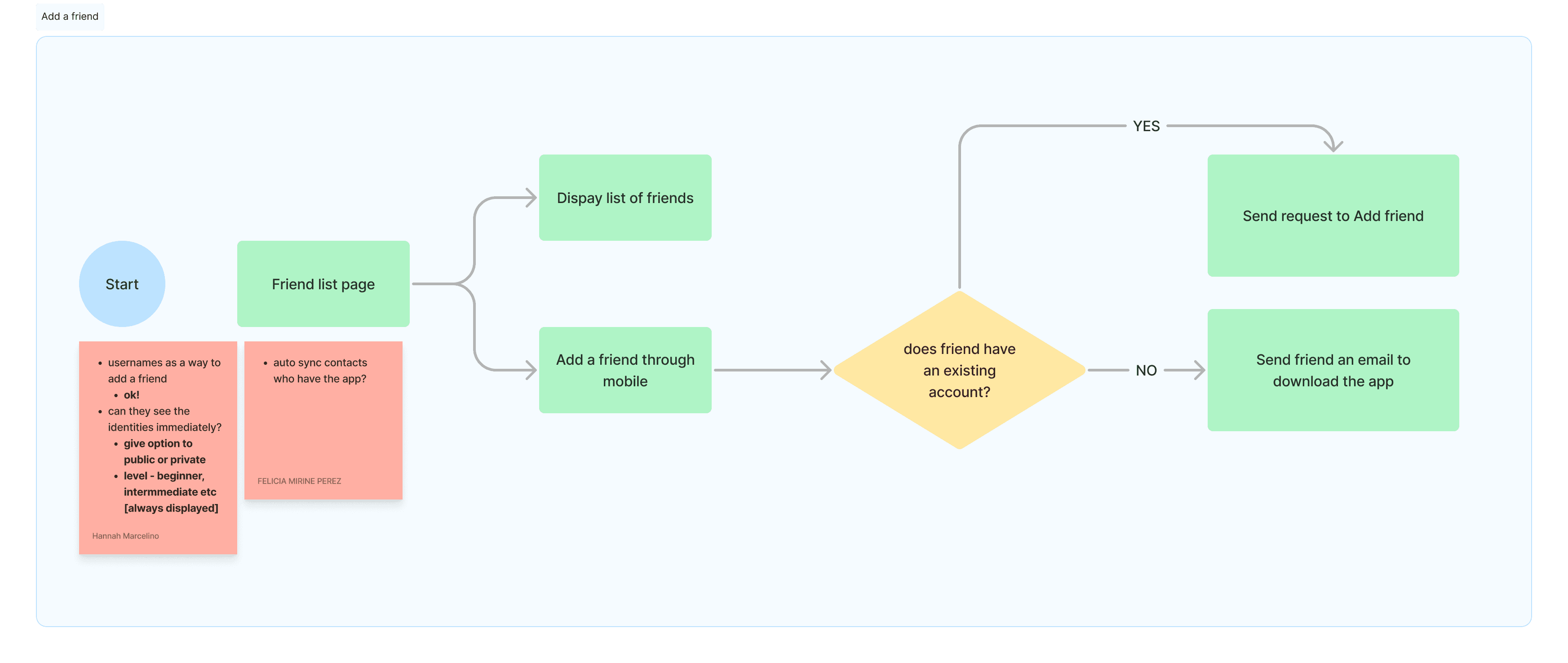
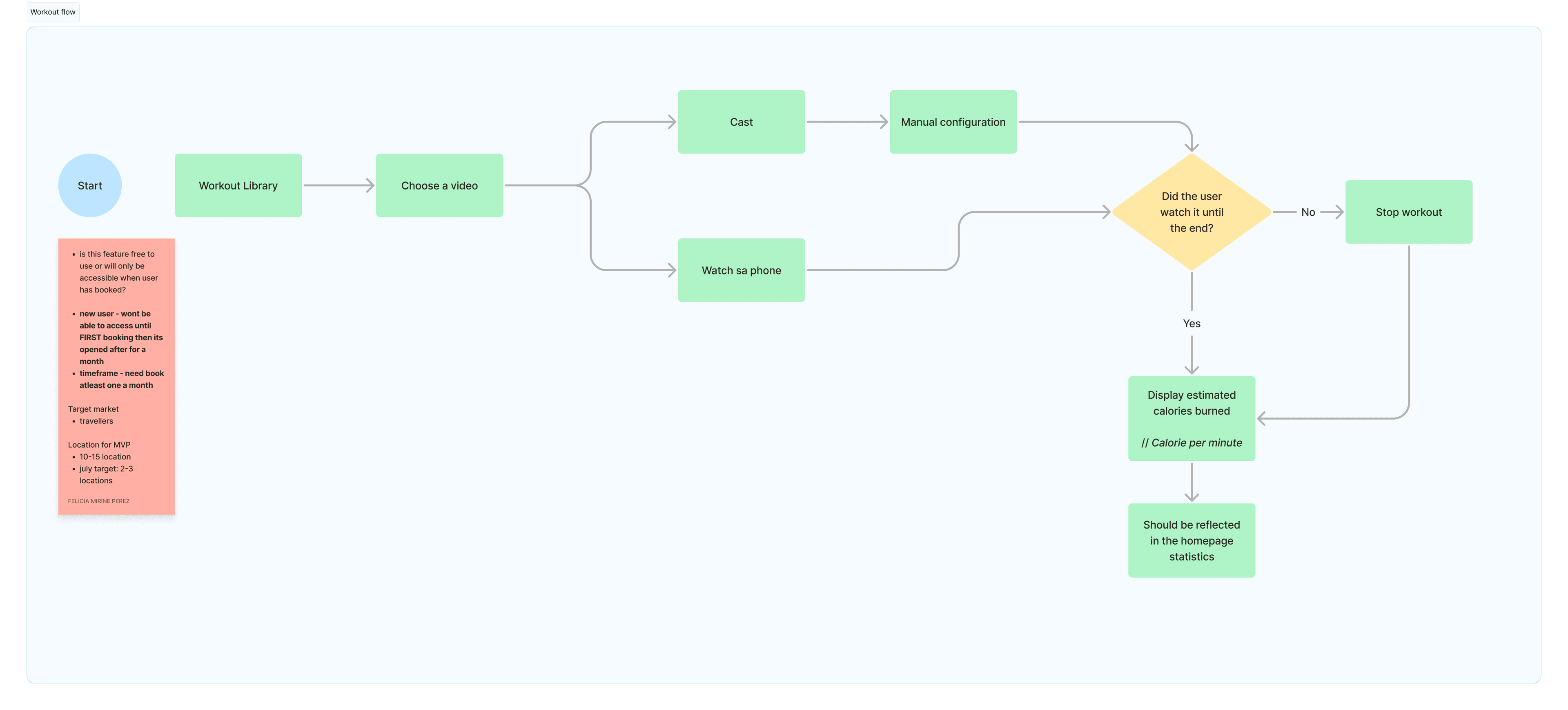
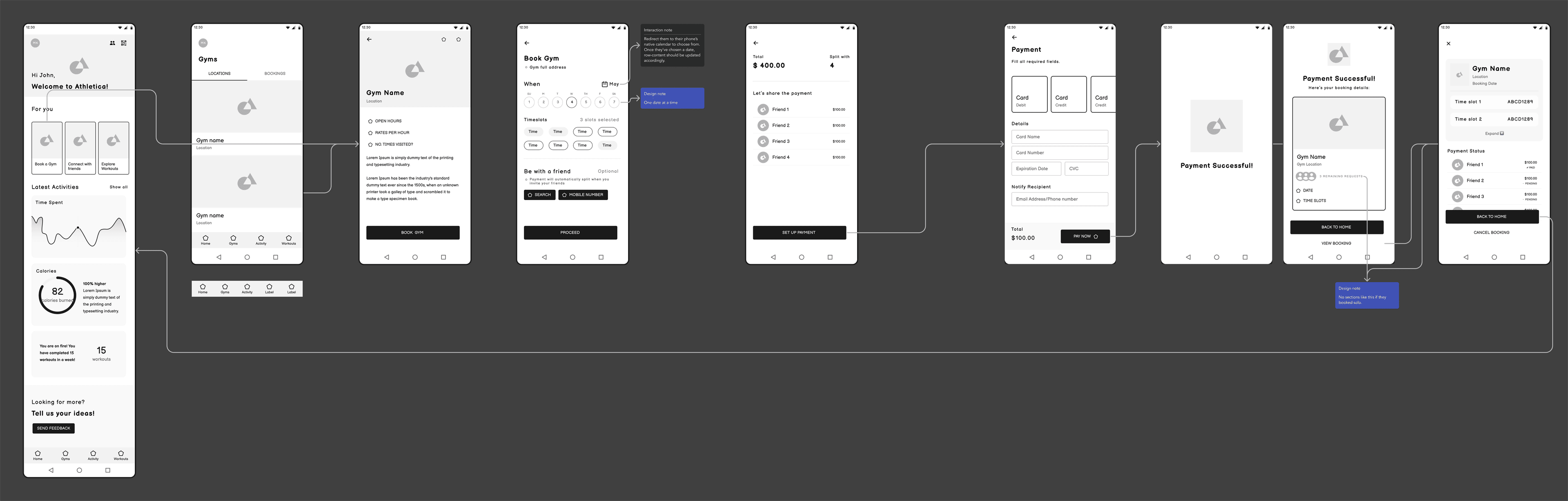
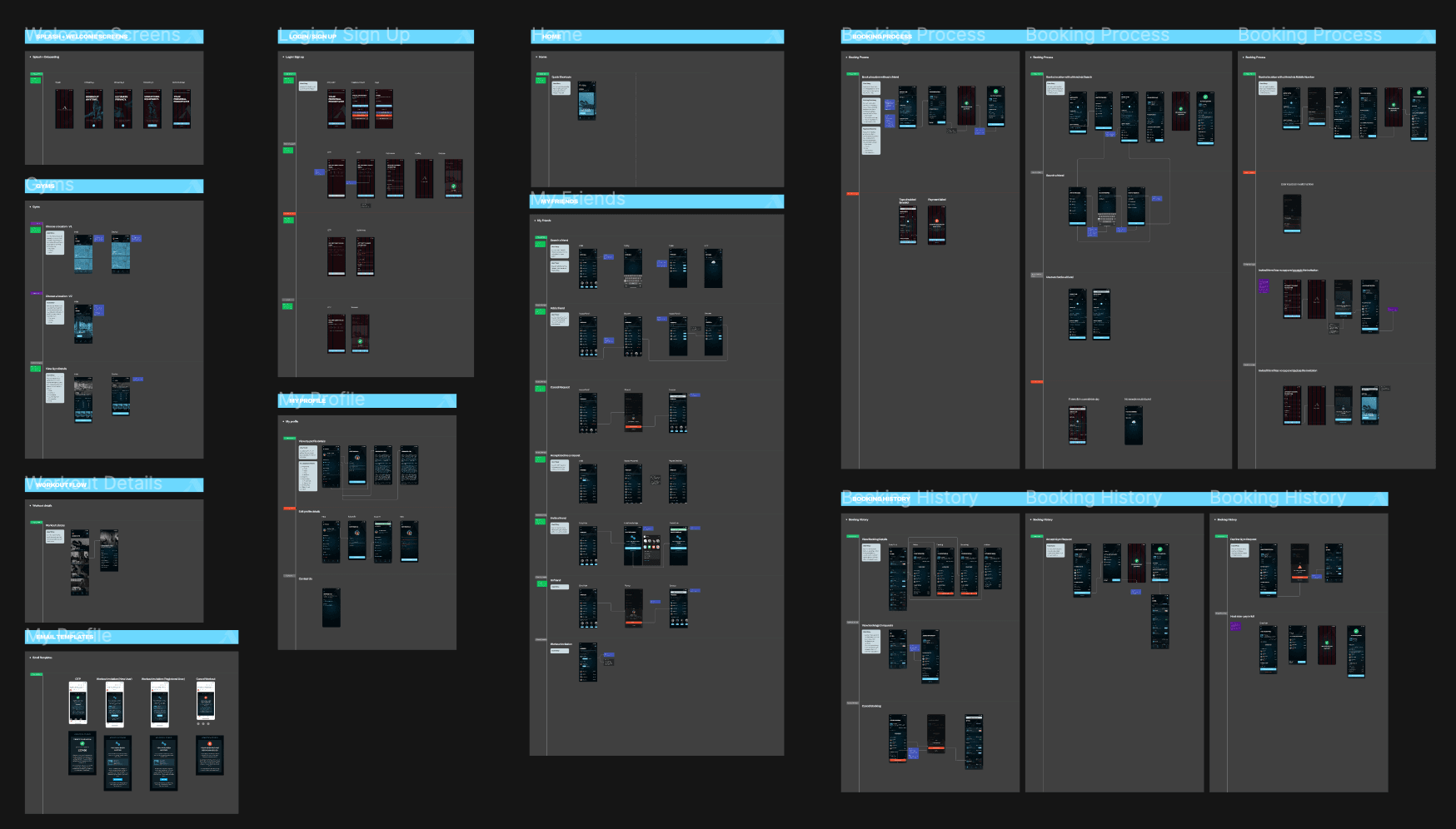
With no existing product to reference, we designed four core user flows that mapped the entire product experience from scratch.
Building the Flow Architecture from Scratch
01
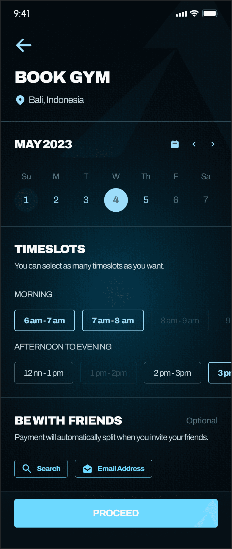
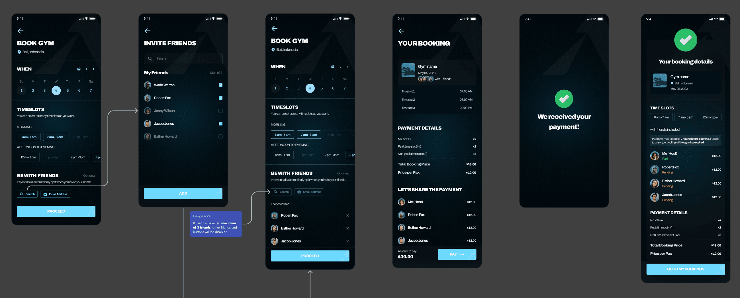
Booking flow: host sideChoose a gym location → select date and timeslots → optionally invite friends (via search or mobile number) → review booking summary with automatic payment splitting → pay → receive confirmation with unique entry code.
02
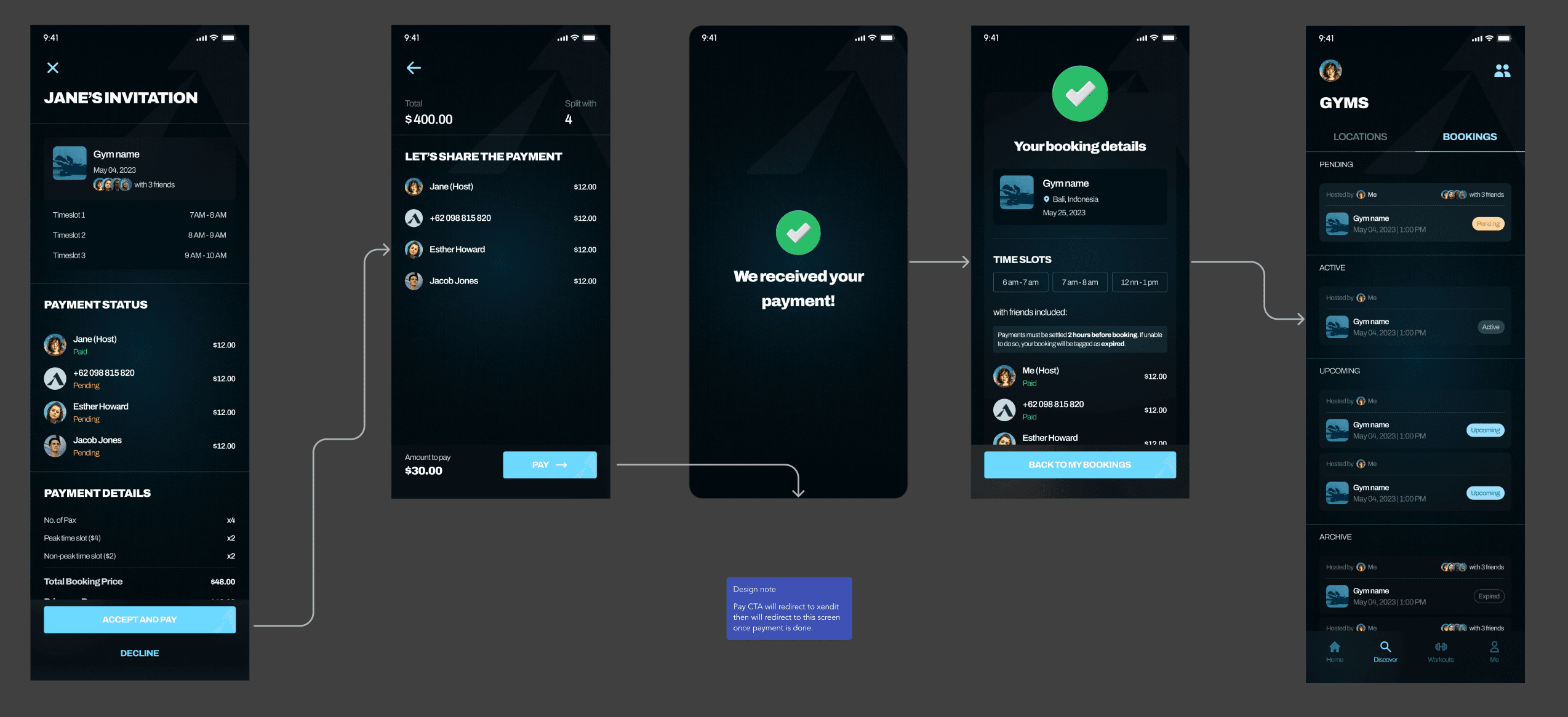
Booking flow: friend sideReceive invitation (via email or in-app notification) → if new user, download app and complete onboarding → review invitation details (gym, timeslots, cost per person) → accept and pay, or decline.
03
Add a friendSearch by name/email or sync mobile contacts → check if the person has an existing account → if yes, send friend request; if no, send an email invitation to download the app.
04
Workout flowBrowse the workout library → select a video → choose to cast to a screen or watch on phone → track estimated calories burned → reflect stats on the homepage dashboard.
Design Decisions in the Flows
Each flow included annotation cards that captured our open questions and rationale, things like "user should not be able to close the bottom sheet unless they choose an action" on the invitation prompt, or "cancel booking won't be visible in the remaining 4 hours before the booking" as a business rule. These weren't afterthoughts; they were part of our design process, ensuring edge cases were addressed before we ever opened Figma.
Design Iteration: Lo-Fi to Hi-Fi
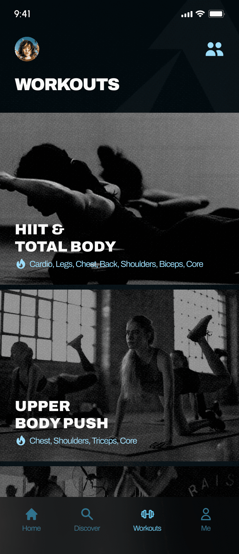
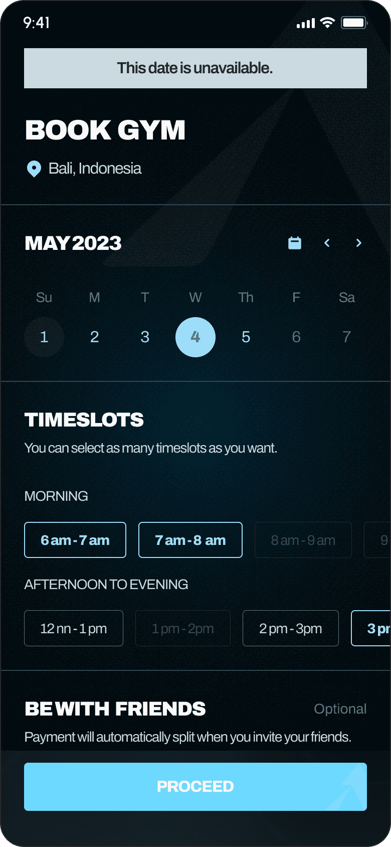
We started with grayscale wireframes to validate structure and interaction patterns before investing in visual design. Key screens included the home dashboard, gym listings, booking flow, friend selection, payment splitting, and workout library.
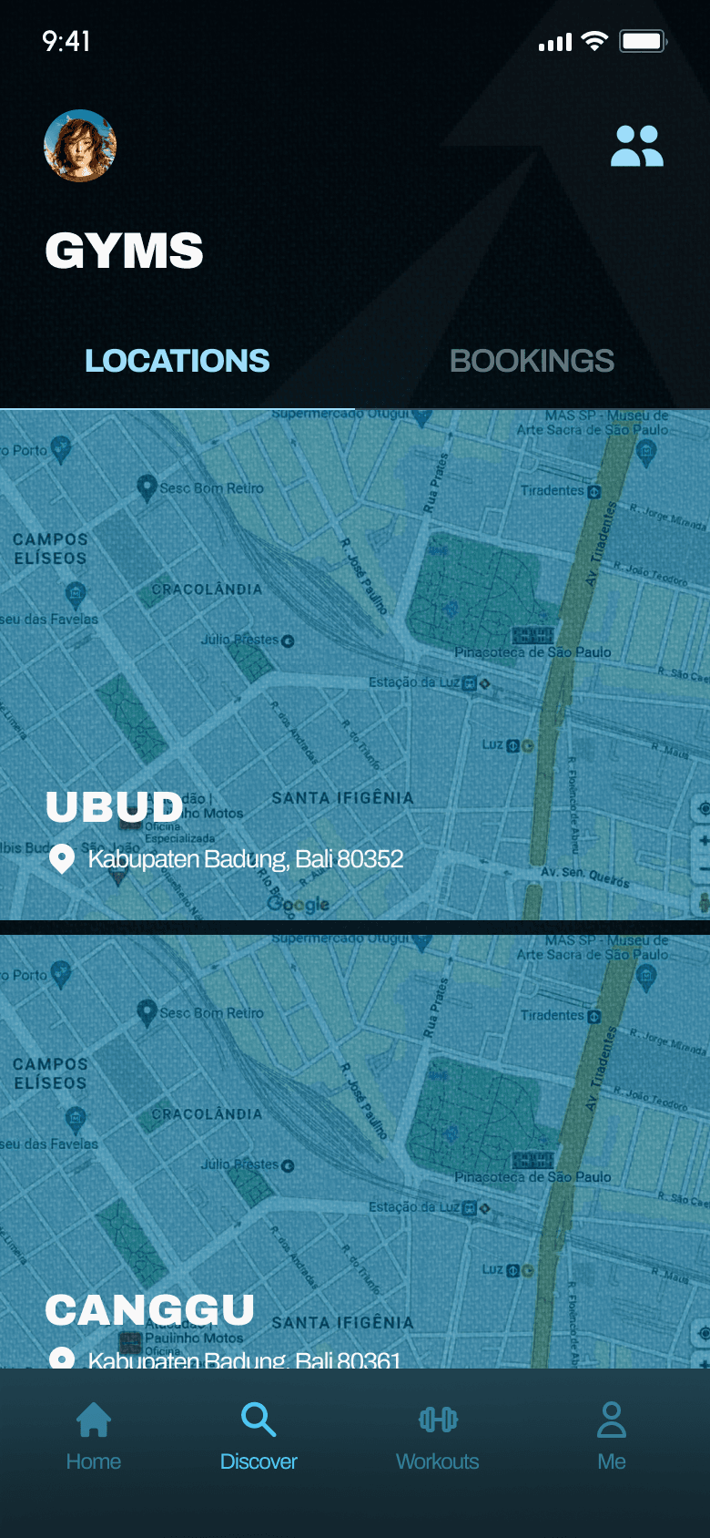
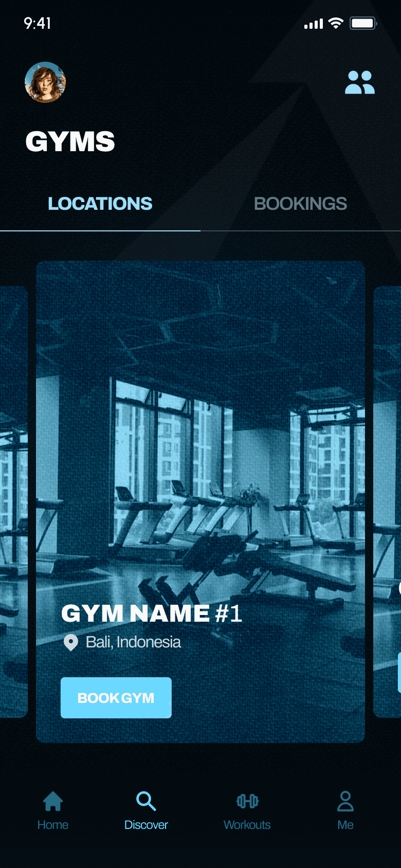
Iteration: Gym Location (V1 → V2)
V1: vertical listGym locations displayed as a vertical scrolling list with map thumbnails: functional but not engaging. Each card showed the gym name and address over a static map tile.
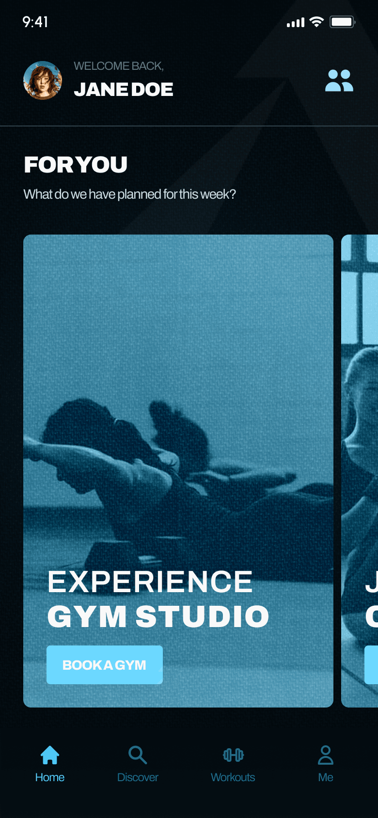
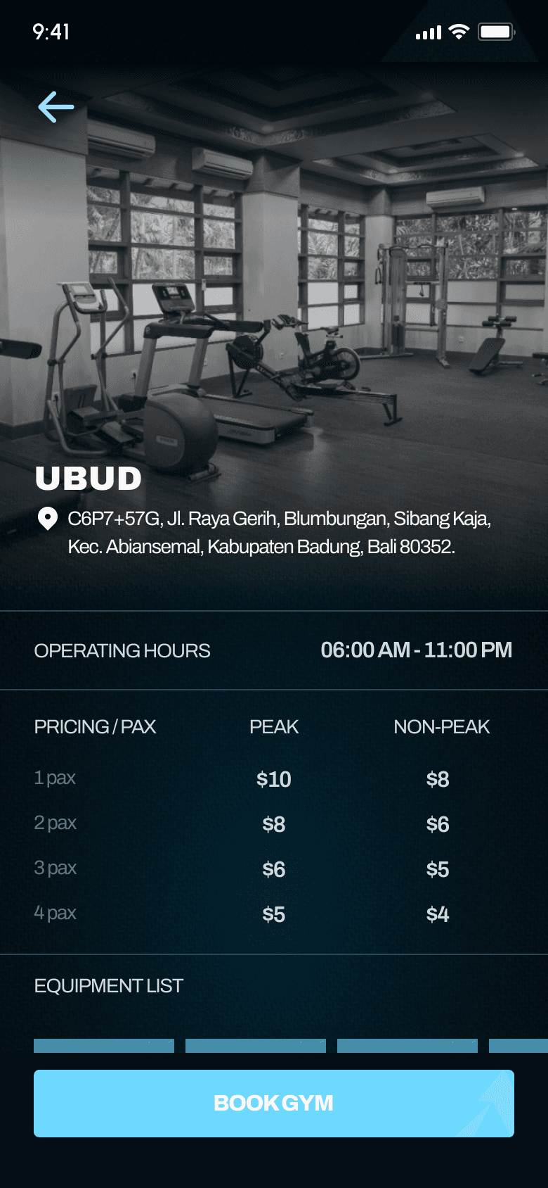
V2: horizontal discovery cardsShifted to a horizontal scroll pattern with large, immersive gym photos, the gym name, location, and a "Book Gym" CTA overlaid directly on the card. Made the browse experience feel more like discovery and less like a directory, tradeoff documented.
Design System
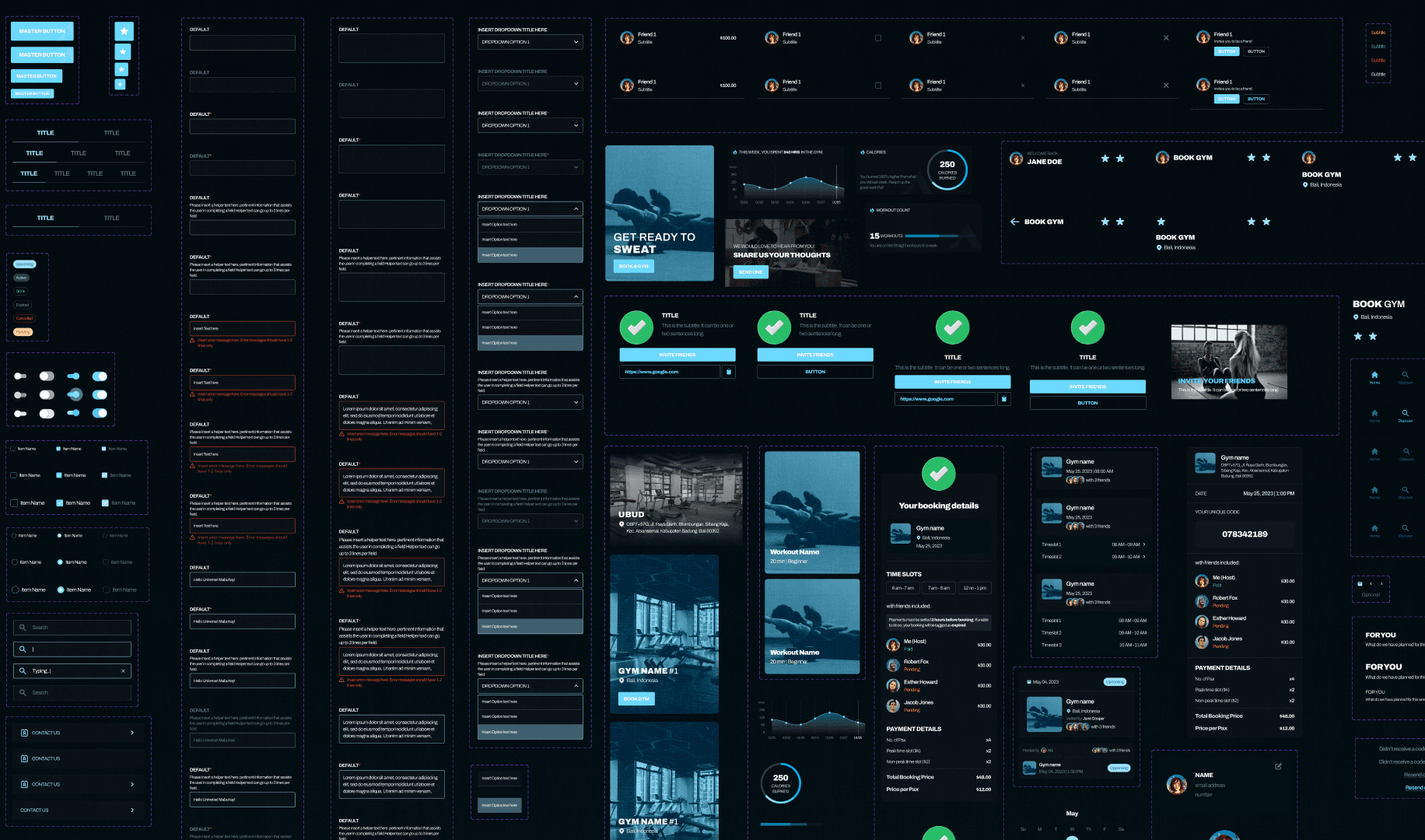
Building from 0→1 meant there was no existing brand language, component library, or visual guidelines to inherit. We created the design system alongside the product, not as an afterthought, but as a foundation that let us move fast without drifting into inconsistency.
Color Palette
We established a dark-mode-first palette built around deep navy/charcoal backgrounds with cyan and teal as primary accent colors. The dark theme creates visual contrast with gym photography, and the cyan accents provide a clean, techy feel that differentiates Athletica from the pastel and white-heavy aesthetic of most fitness apps. We also defined semantic colors: green for success states, red/coral for destructive actions, amber/yellow for warnings, and muted grays for disabled or inactive elements.
Blue Dark#0381AF
Blue#6CD8FF
Blue Semi#4EC7F5
Blue Light#9DDDFA
Black#0D0D0D
Black Semi#161616
Black Light#232323
Text#F9F9F9
Text Mid#CBDAE0
Text Low#607881
Info Dark#656C6F
Info#B4BBBD
Info Semi#8E8E8E
Info Light#3D3D3D
Negative#E74C3C
Positive#2AD673
Attention#F7B200
Typography
Bold, condensed uppercase headings for screen titles (BOOK GYM, YOUR BOOKING, FRIENDS) give the app an athletic, editorial feel, paired with clean sans-serif body text for readability. Section labels use a smaller uppercase treatment to create scannable structure within screens. This typographic system kept the UI consistent across 50+ screens without requiring constant design review.
TypefaceArchivo
Display32px · Black
BOOK GYM
Heading24px · Bold
YOUR BOOKINGS
Subheading18px · Semibold
Upcoming Sessions
Body16px · Regular
Choose your gym, invite a friend, and split the cost, all in one booking.
Label12px · Medium
ACTIVE · PENDING · UPCOMING
Component Patterns
Through the design process, we established reusable patterns that became the backbone of the product. Having these defined early meant new screens could be assembled quickly, critical given our 3 to 4 week timeline.
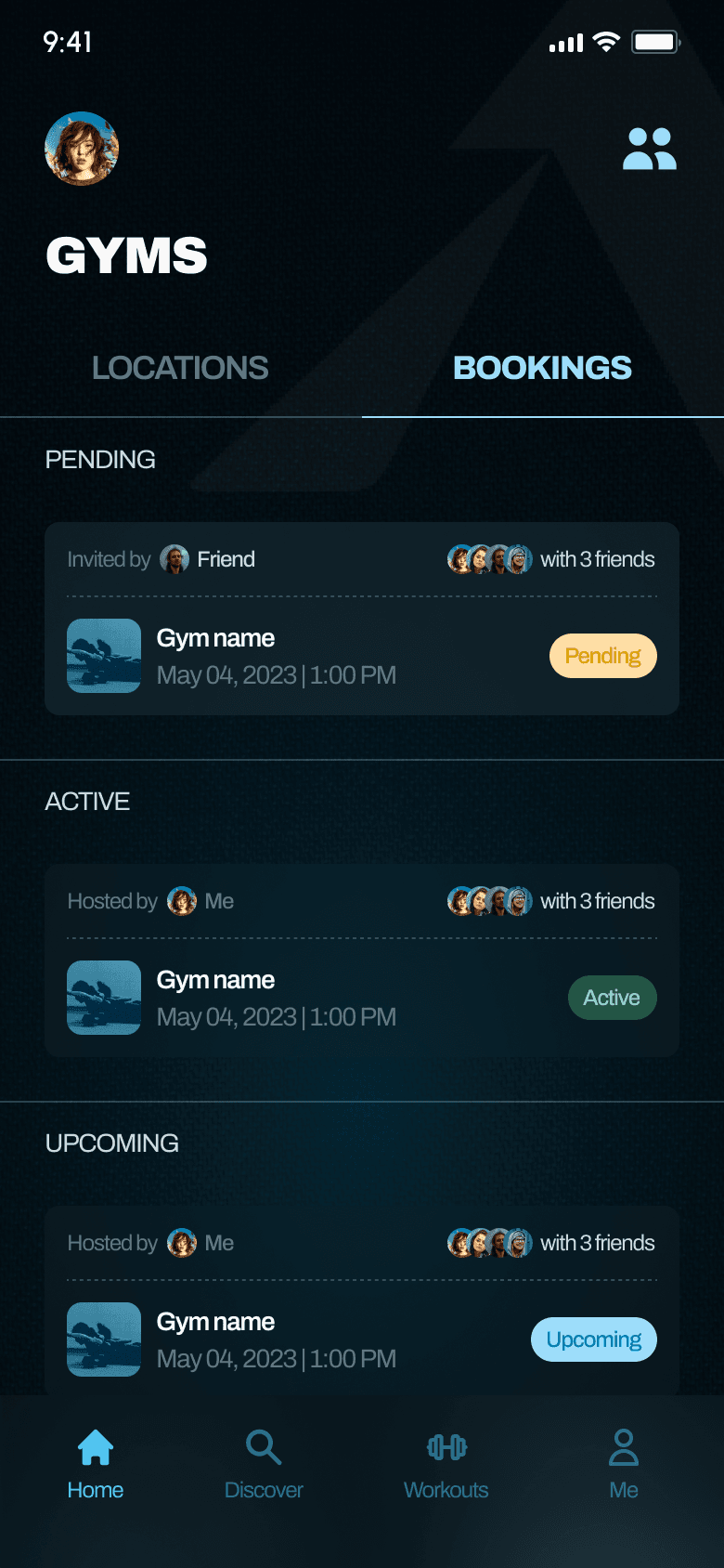
—Status badges (Active, Pending, Upcoming, Expired, Cancelled) with consistent color coding
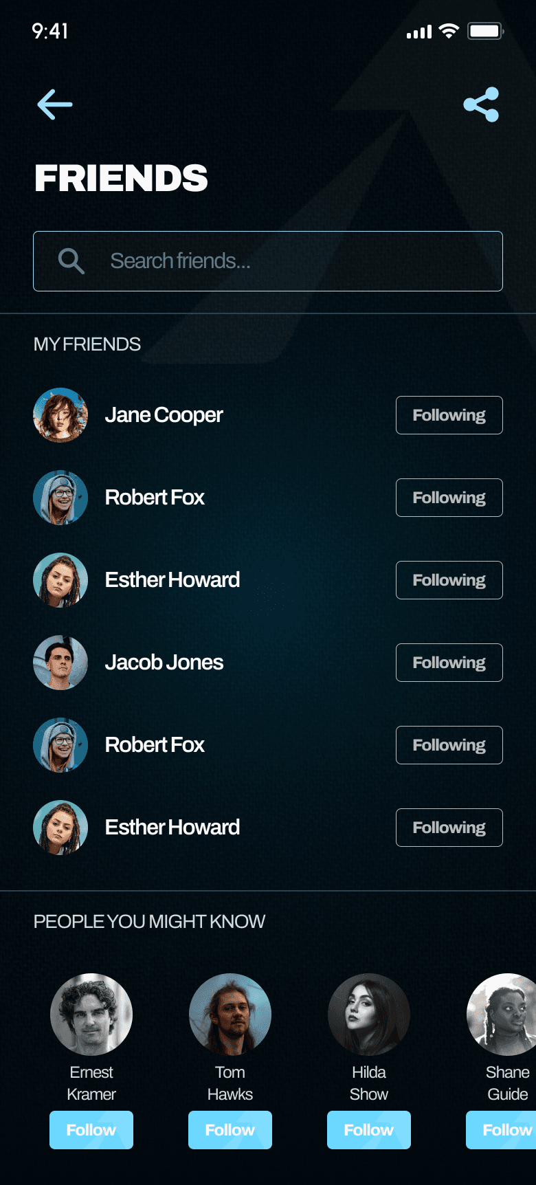
—Friend list items with avatar + name + status pill
—Booking cards with host info and friend avatars
—Inline timeslot chips with selected/disabled/available states
Final Design & Key Screens
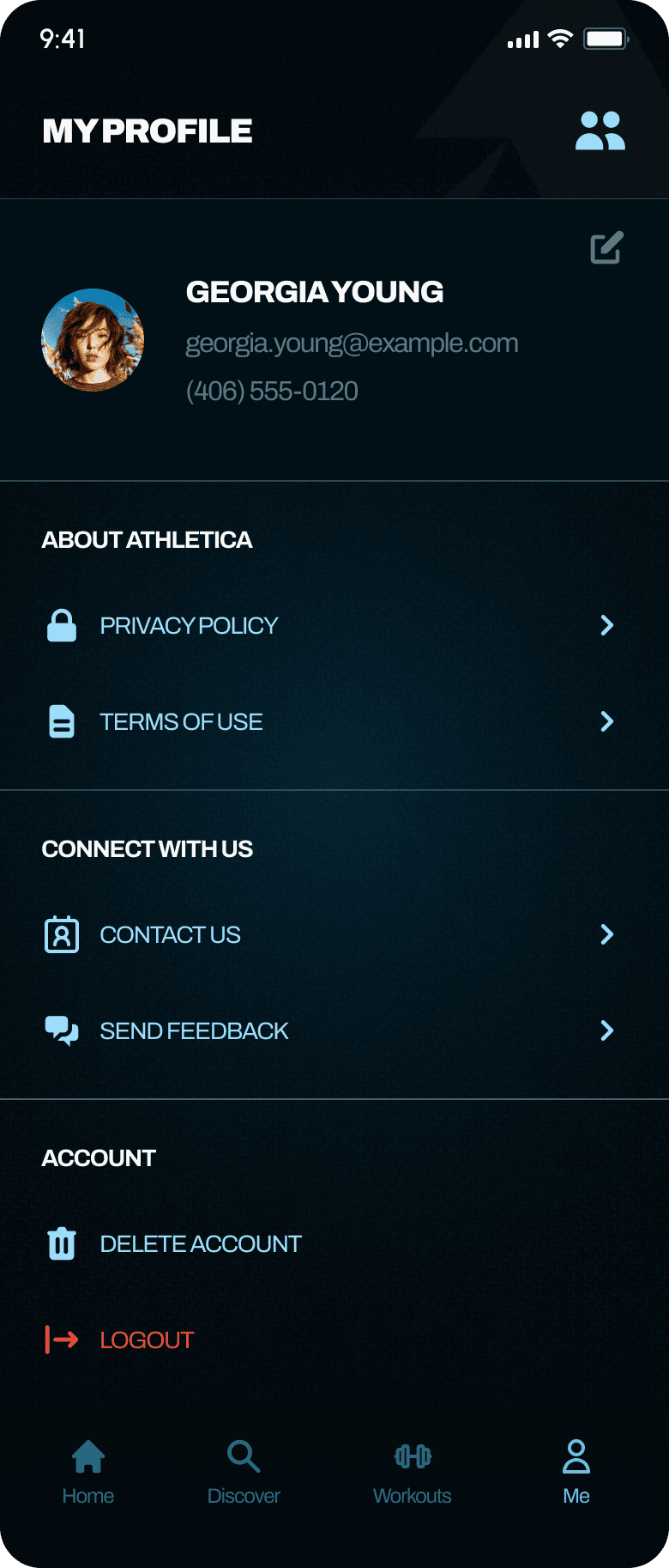
The final UI uses a dark theme with cyan/teal accents: a deliberate choice to feel premium, modern, and distinct from the pastel-heavy fitness app market. The Athletica brand mark (a stylized "A") appears as a subtle watermark across screens, reinforcing brand presence without competing with content.
Core Screens
Edge Cases & Error States
A core part of our 0→1 process was designing for failure, not just success. In a social product, the unhappy path is just as common as the happy one.
01
Disabled timeslotToast notification explaining the slot is unavailable, with the chip visually grayed out.
02
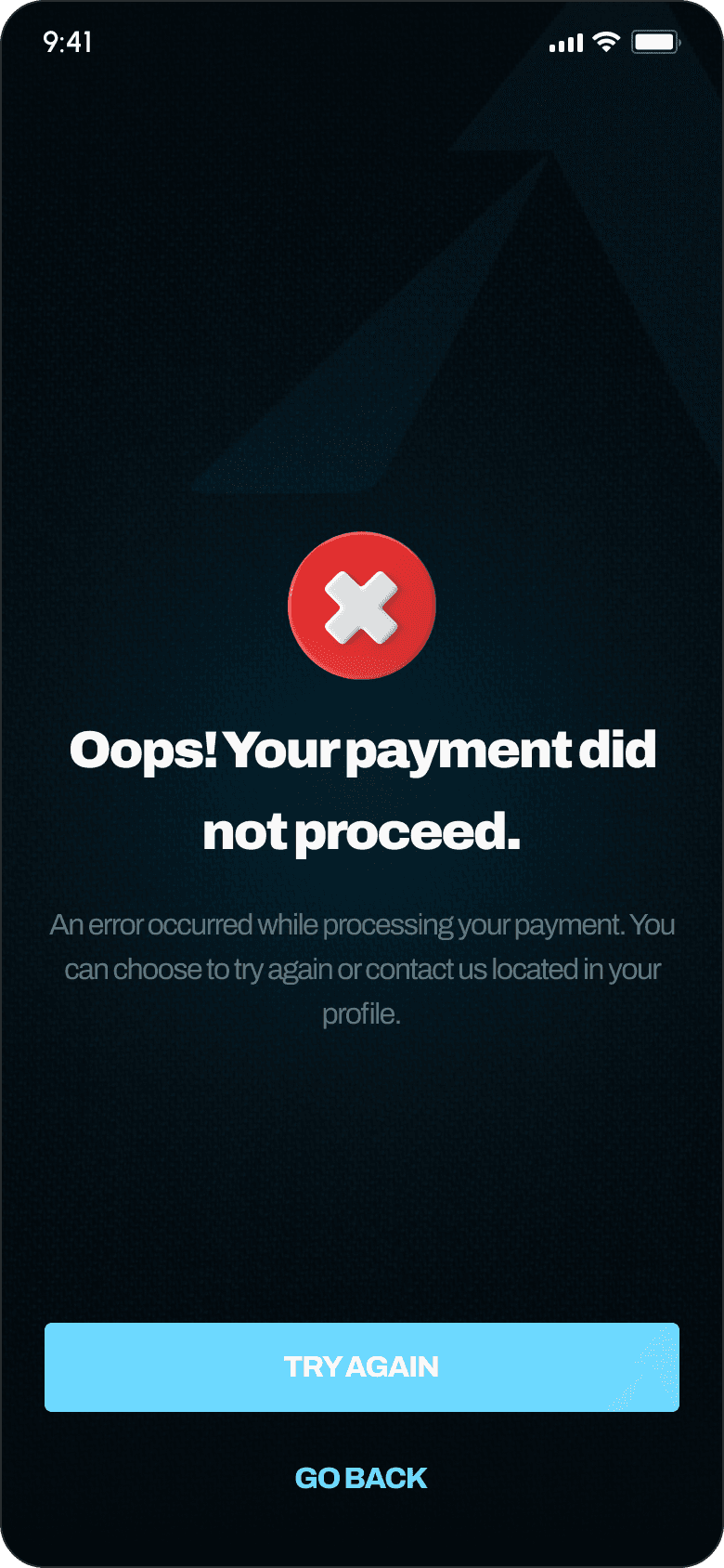
Payment failedFull-screen error with a clear "Try Again" primary action and "Go Back" secondary.
03
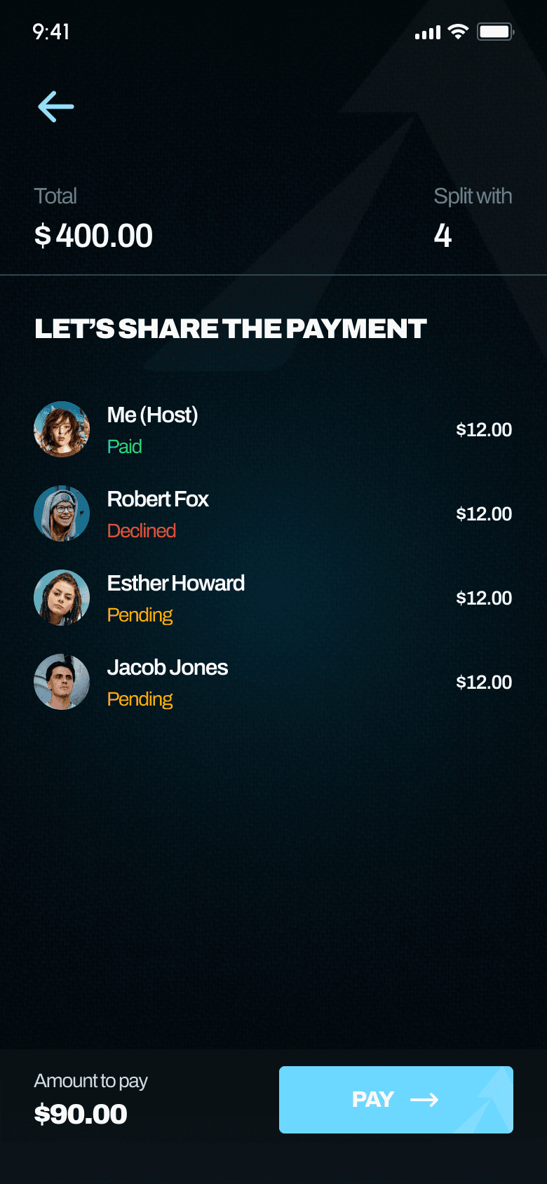
Friend declined invitationNotification badge on the Bookings tab with a detail screen offering the host two clear options: "Proceed to Payment" or "Cancel Booking."
04
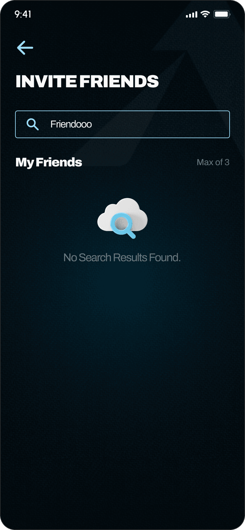
No search resultsFriendly empty state with illustration when searching for friends who don't exist in the system yet.
05
Empty workout library (new user)"No workouts for now!" message with a CTA directing them to book their first gym session, creating a natural onboarding loop.
Two-Sided Experience Design
Because Athletica is fundamentally a two-sided product: the person booking and the person being invited, we designed complete flows for both perspectives. Every feature had to work from two angles, which doubled our design surface but made the product feel complete rather than half-built.
Host experienceBook → invite → pay your share → track friends' payment status (paid, pending, declined) → receive unique entry codes → view booking in Active, Upcoming, or Archive states.
Invited friend: existing userReceive invitation in the Friends screen → view gym details, timeslots, and cost → "Accept and Pay" or "Decline" → payment via Xendit → booking appears in their Bookings tab.
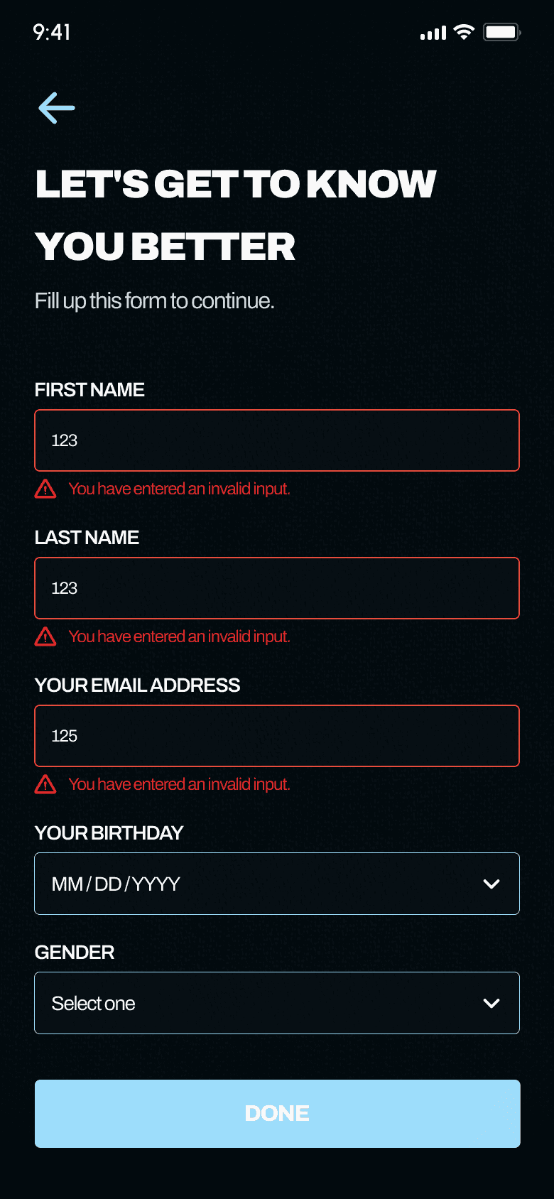
Invited friend: new userReceive email invitation → download app → complete onboarding form → land on home screen with invitation bottom sheet → accept or decline → if accepted, proceed to payment.
Entry codes & booking statesEach confirmed booking generates a unique entry code shared between all participants. Bookings live in Active, Upcoming, or Archive tabs with clear status labels.
Communication Design
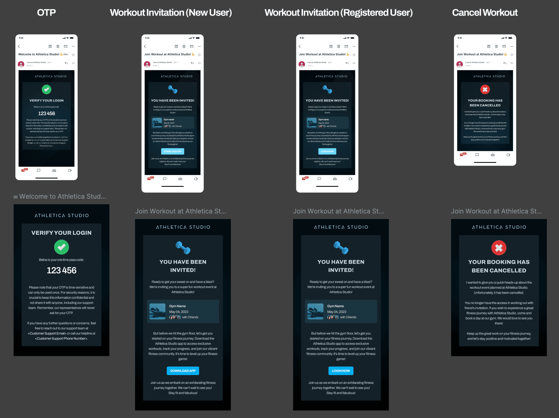
We also designed the full email template system to cover every transactional touchpoint.
—OTP verification - one-time passcode with security messaging
—Workout invitation (new user) - warm copy encouraging download, with gym details and a "Download App" CTA
—Workout invitation (registered user) - same layout but with a "Login Now" CTA
—Booking cancelled - clear cancellation notice with an encouraging message to rebook
Results & Retrospective
What We Delivered
In 3 to 4 weeks, a team of 2 to 3 designers took Athletica from a client's idea to a fully designed mobile product.
—4 complete user flows mapping every core journey
—50+ unique screens across lo-fi wireframes and hi-fi mockups
—A full design system: color palette, typography scale, and reusable component patterns built from scratch
—Full state coverage including loading, empty, error, and edge case states
—Email template system for transactional communications
—Design documentation with user stories, acceptance criteria, interaction notes, and scenario annotations baked into every screen
—Dev-ready handoff with component-level design notes explaining interaction behavior
What I Learned
01
Designing in ambiguity is the job.The client didn't hand us a PRD. We had to ask the right questions, make informed assumptions, and document our reasoning. The annotation cards on our flows became one of the most valuable artifacts, they turned "I'm not sure" into "here's what we decided and why."
02
Edge cases aren't edge cases.In a social product, the unhappy path is just as common as the happy one. Friends decline invitations. Payments fail. People search for users who don't exist yet. Designing for these moments early is what separates a concept from a real product.
03
Two-sided thinking changes everything.Every feature we designed had to work from two perspectives. The booking screen looks different when you're the host vs. the invitee. This doubled our design surface but made the product feel complete rather than half-built.
04
Speed requires structure.Shipping this much design in under a month was only possible because we invested time upfront in flow architecture. Once the flows were solid, the screens almost designed themselves, we knew exactly what each screen needed to do and how it connected to everything else.
If I Had More Time
—Usability testing: particularly on the booking + friend invitation flow, since it's the core differentiator and where friction is highest.
—Onboarding optimization: the new-user-invited-by-friend flow has a lot of steps (download → sign up → onboarding form → invitation). I'd explore ways to reduce friction, like pre-filling data from the invitation email.
—Accessibility audit: the dark theme with cyan text needs contrast ratio validation, particularly on secondary text and disabled states.