Queue Up: Swipe-Based Co-op Matchmaking for Gamers
Finding Your Player Two Shouldn't Be This Hard
Overview
A mobile app that helps gamers find compatible co-op partners through a swipe-based matching experience. Players connect based on shared game libraries and play styles, making Looking for Gamers (LFG) feel as fast and effortless as swiping right.
Role
Founding Designer & Product Lead: designed the core user experience, created the visual design system, and led user research and testing.
Tech Stack
The Problem
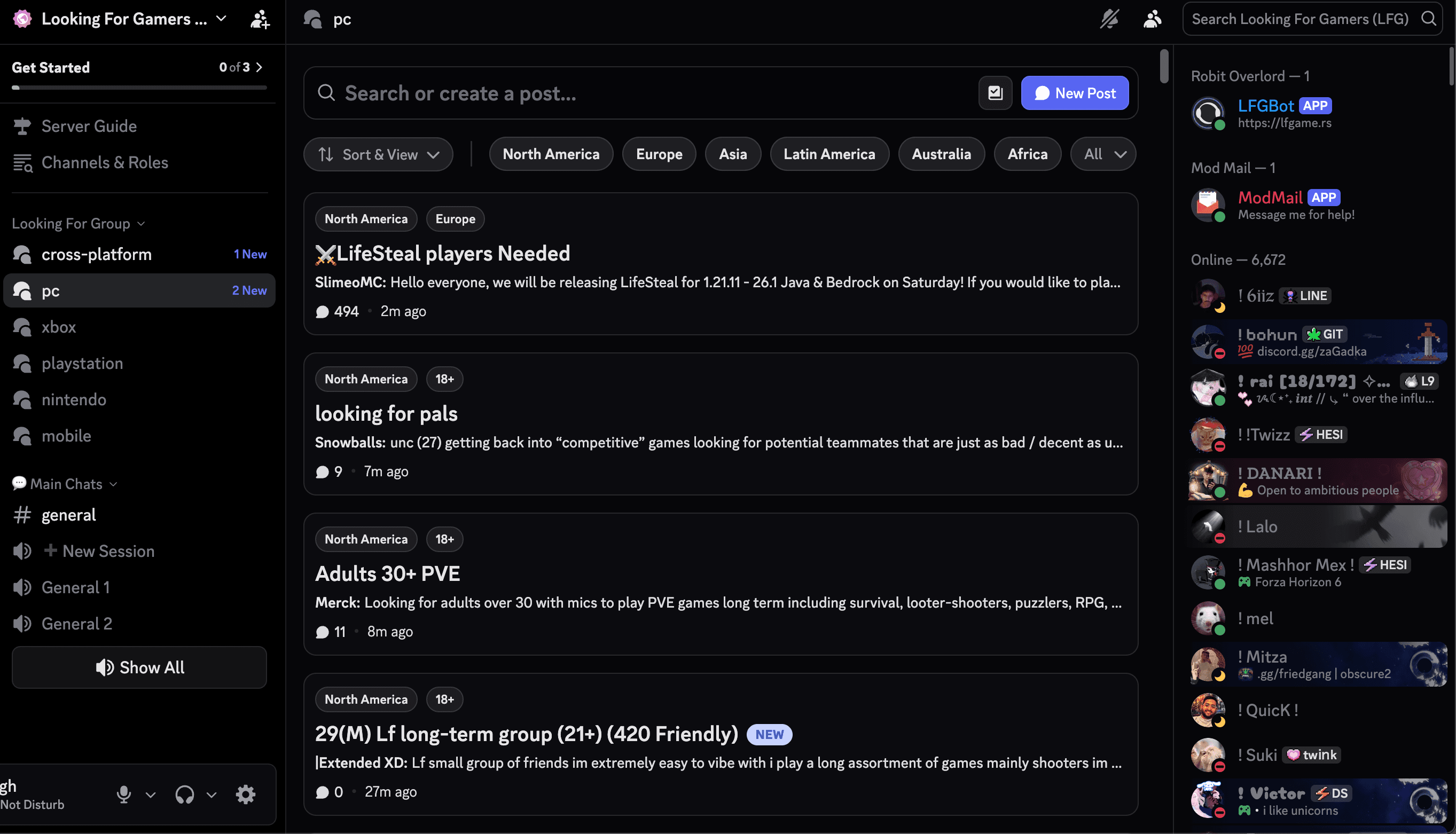
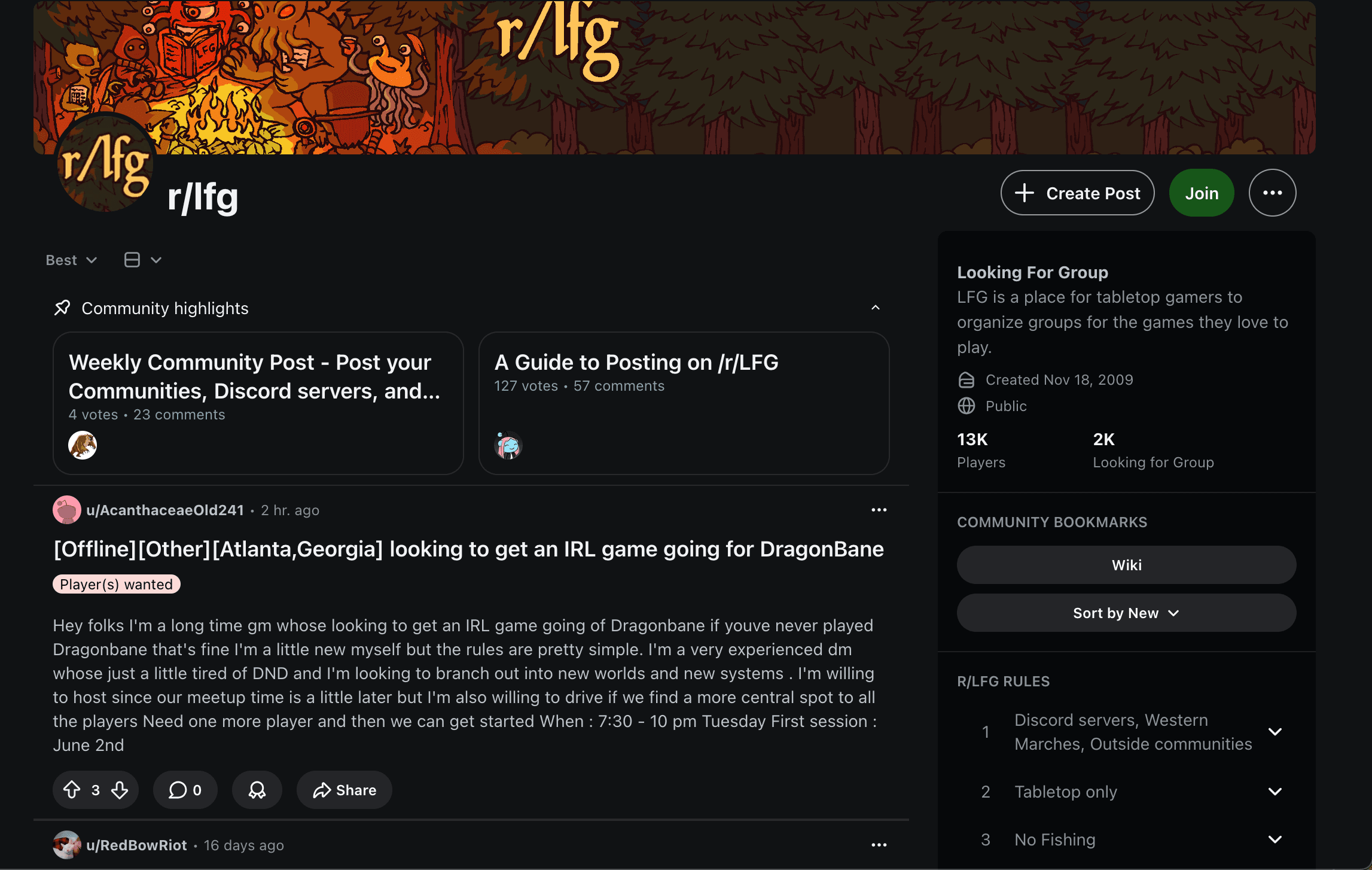
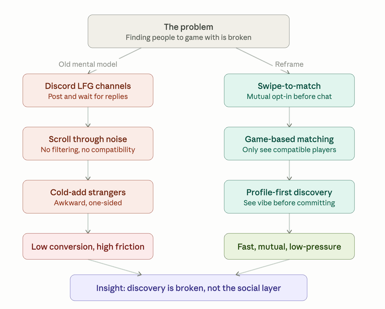
Gaming is inherently social, but finding people to actually play with is surprisingly broken. Your friends are offline, in a different time zone, or playing something else entirely. The fallback: scrolling through Discord LFG channels, posting in subreddits, or cold-adding strangers after a random public match is slow, impersonal, and rarely leads to lasting connections.
There's no dedicated, low-friction way to find someone who plays the same games, matches your vibe, and is actually looking for a teammate right now.
The Insight
Through informal conversations with gamers in my own circle, a consistent pattern emerged: people weren't looking for another platform to hang out on. They already had Discord and group chats for that. What was missing was a fast, intentional way to discover the right person to play with in the first place.
The mental model that kept coming up was dating apps, not because gamers want romance (though Queue Up supports that too), but because the core interaction, quick profile scan, swipe yes or no, chat only when both sides opt in, maps perfectly onto the teammate discovery problem. It's familiar, fast, and respects both people's time.
Competitive Analysis
No existing platform sits at the intersection of game-specific matching, swipe-based discovery, and mutual intent. Discord and Reddit serve the LFG need but require manual effort and have no matchmaking layer. Kippo and Gg are gamer-focused dating apps but deprioritize in-game compatibility. Queue Up fills the gap.
| Gamer Profiles | Swipe Discovery | Game-Based Matching | Playstyle Filters | Mutual Match Required | |
|---|---|---|---|---|---|
| Discord LFG | — | — | ✓ | — | — |
| Reddit LFG | — | — | ✓ | — | — |
| Kippo | ✓ | ✓ | — | — | ✓ |
| Gg.gg | ✓ | ✓ | ✓ | — | ✓ |
| Queue Up | ✓ | ✓ | ✓ | ✓ | ✓ |
The Approach
With a small team and a three-week timeline, I had to be ruthless about scope. Rather than building wide, I focused on designing four core experiences end-to-end, with every edge case and empty state accounted for.
Onboarding, Building a Gamer Identity in Under Two Minutes
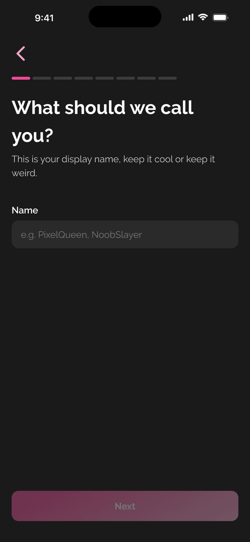
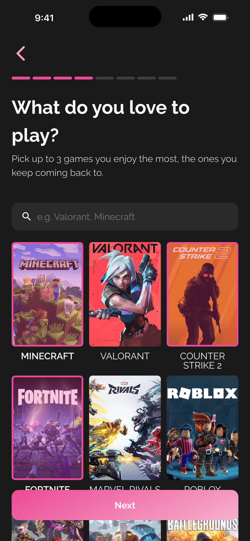
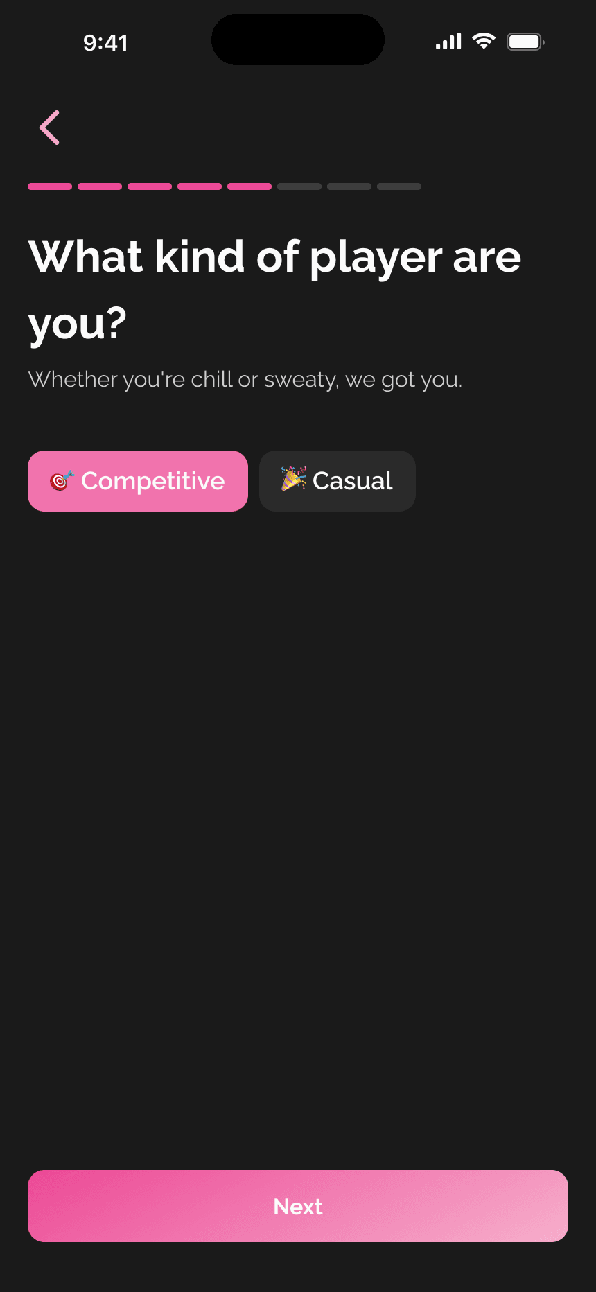
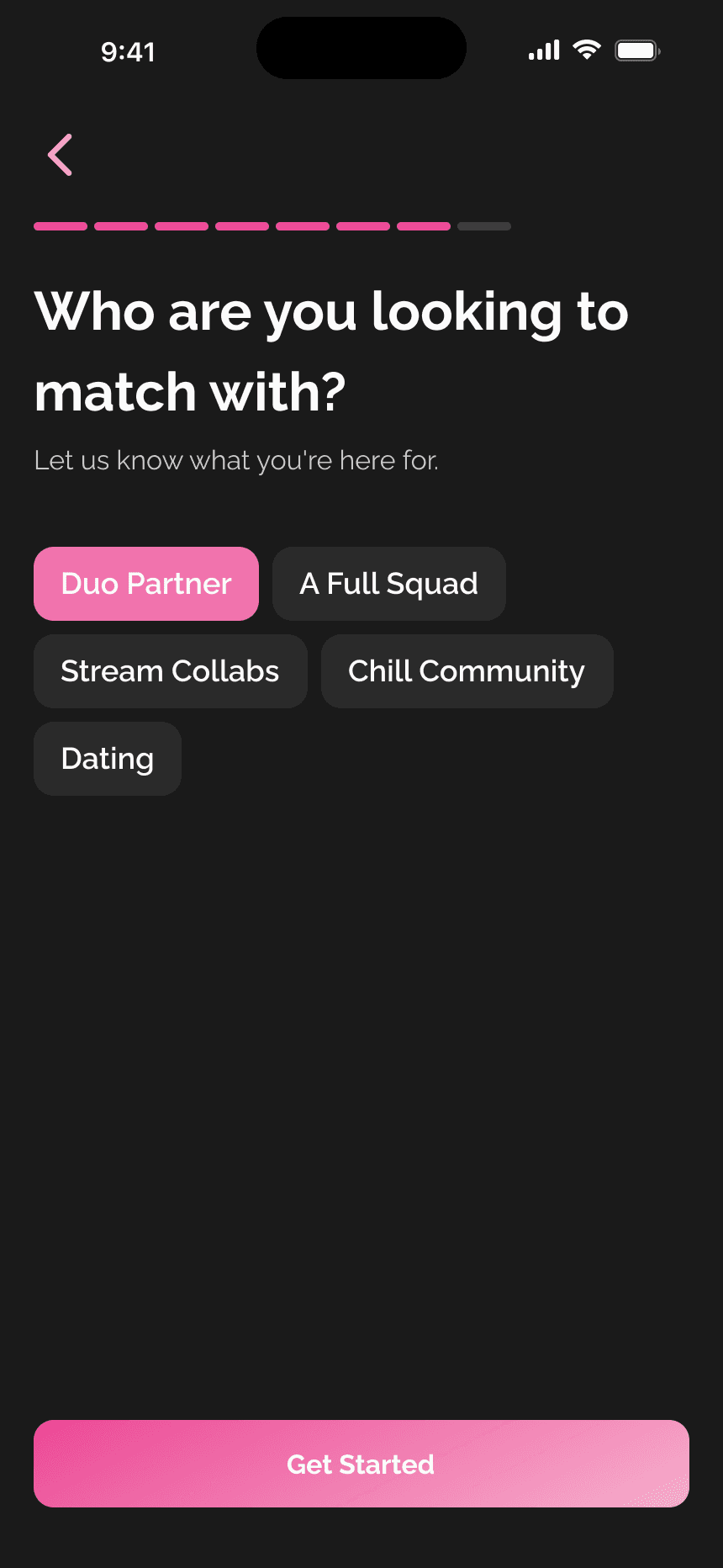
The onboarding flow needed to accomplish two things: collect enough data to power smart matching, and feel quick enough that users don't drop off. I broke it into eight focused steps, each screen asking for exactly one thing: display name, birthday, location, games currently playing, playstyle, bio, match preferences, and photos.
Key design choices
The Swipe Experience, The Core Loop
This was the hardest design challenge on the project. The swipe mechanic is well-understood from dating apps, but transplanting it into a gaming context risked two things: feeling too romantic, or feeling too shallow.
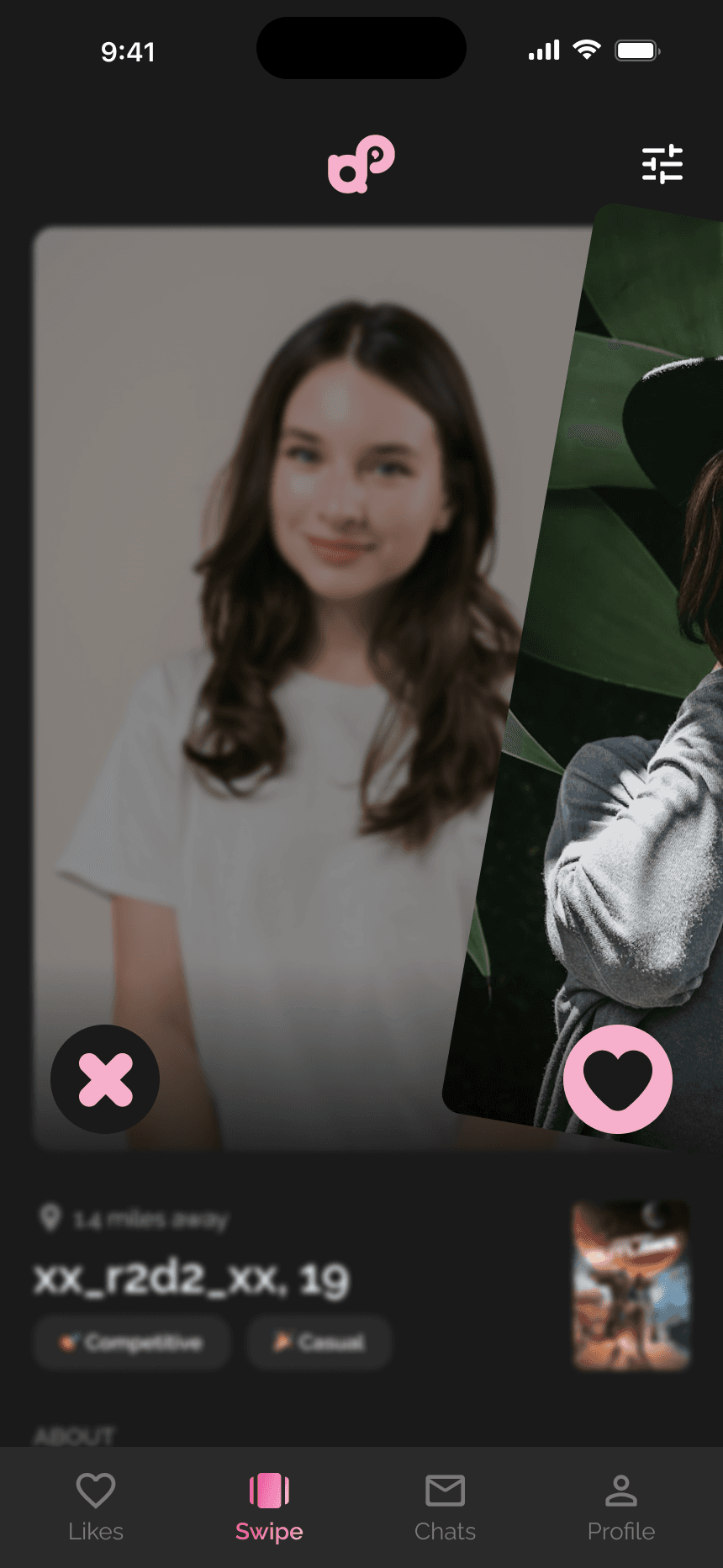
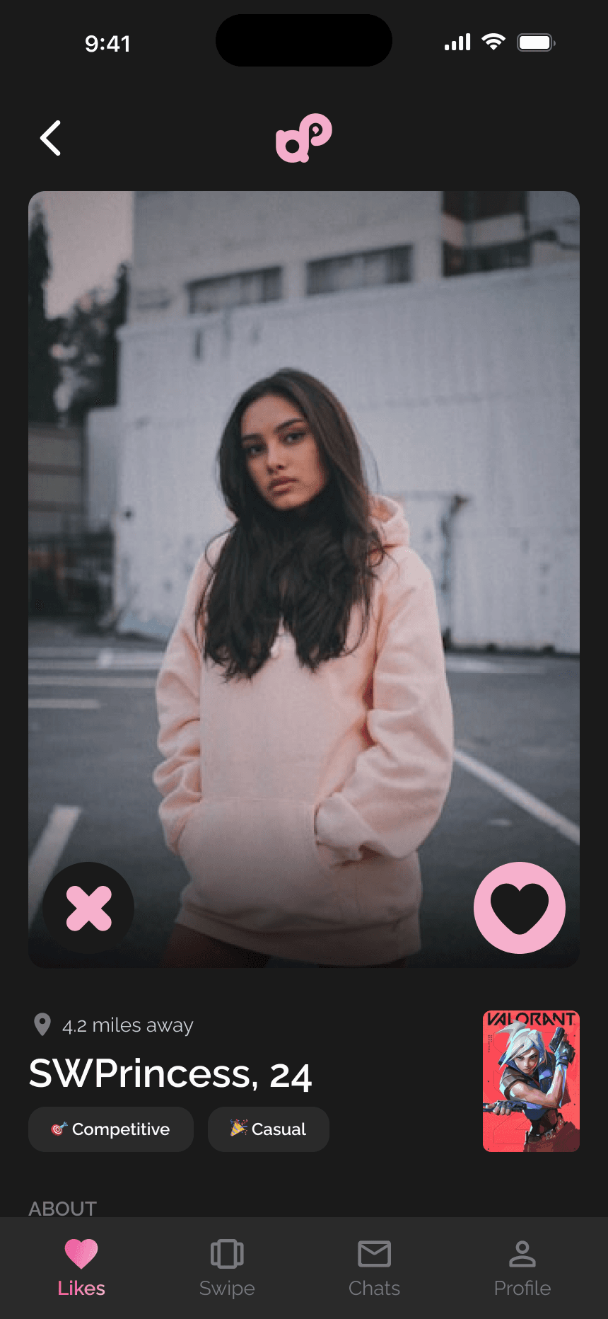
Each profile card shows the user's photo taking up most of the screen, with pass and heart buttons overlaid at the bottom corners. Below the photo: distance, gamertag, age, playstyle tags, and a thumbnail of the game they're currently playing. Tapping the card expands it into a full profile view with bio, full game library, what they're looking for, a favorite gameplay clip, and a photo gallery.
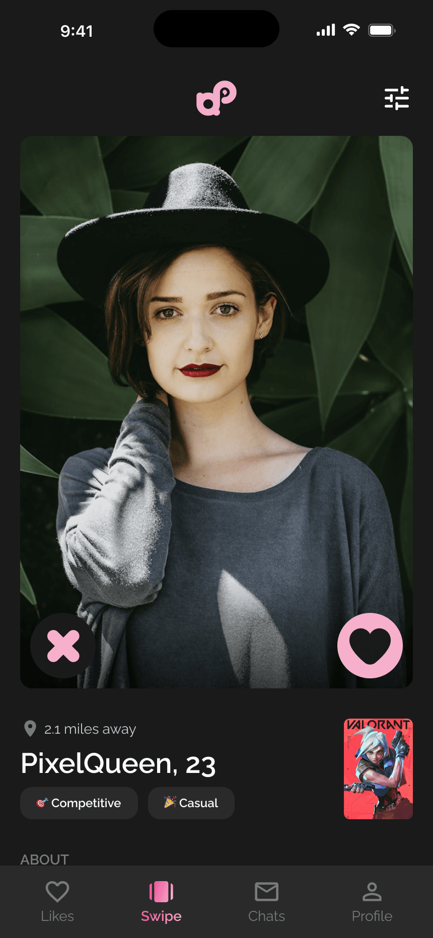
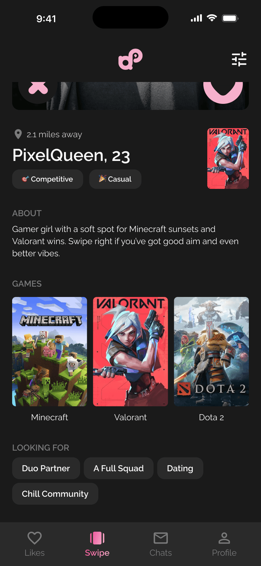
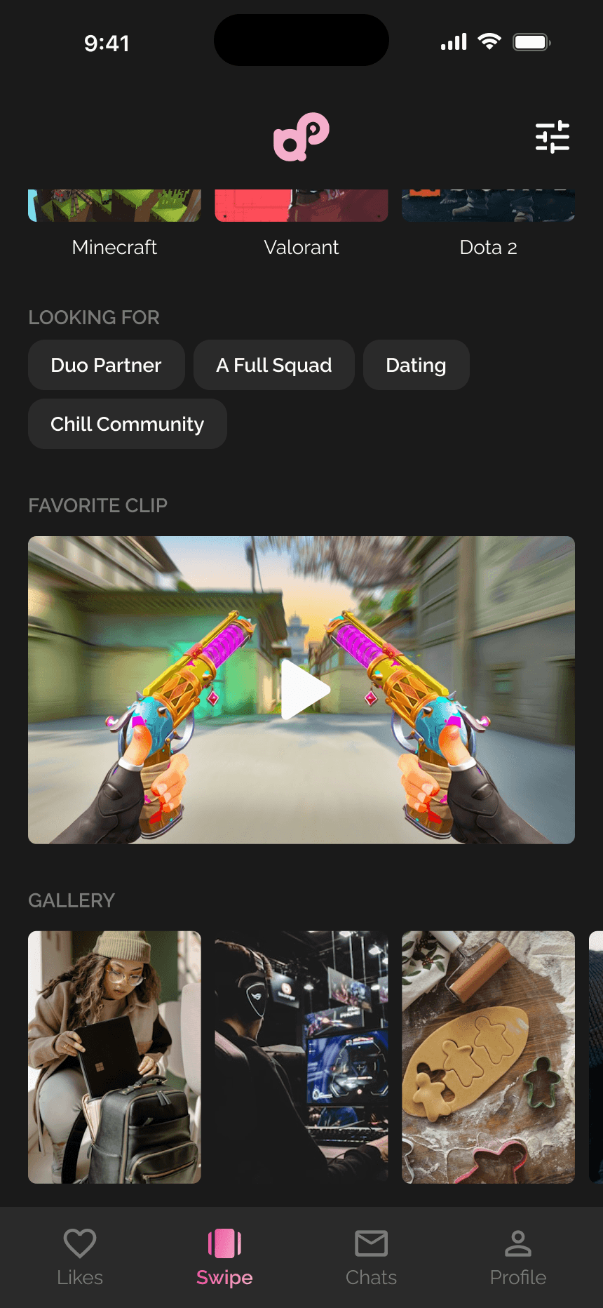
The information hierarchy was deliberate. At swipe level you get just enough for a gut call, do they look cool, are they nearby, do they play what I play? Scroll down for full signal before committing. This two-tier approach (glanceable card → detailed scroll view) reduces decision fatigue without sacrificing depth.
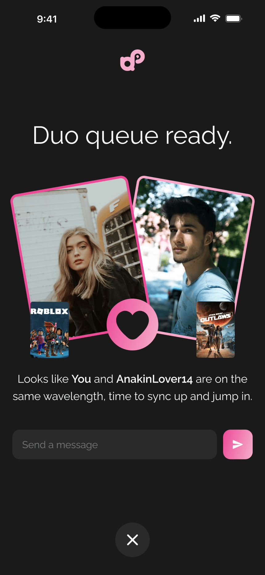
When both users swipe right, a match screen appears with both profile photos at playful angles, a heart icon connecting them, and the line "Duo queue ready", along with a message input so you can start chatting immediately. The copy and visual language are intentionally gaming-coded to keep the context firmly in teammate territory.
Likes, See Who's Already Interested
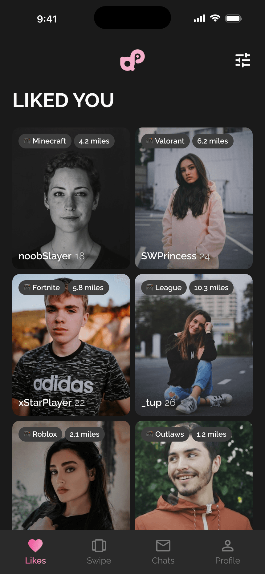
The Likes tab shows a grid of users who have already swiped right on you. Each card displays their photo, gamertag, age, the game they play, and their distance. Tapping any card opens their full swipe profile where you can like or pass.
This screen serves a strategic purpose beyond showing interest: it gives users a sense of momentum and social proof, especially early on when the platform is still growing. Seeing that people already liked you is a strong retention hook, it pulls users back into the swipe flow with higher intent.
Messaging, From Match to Squad
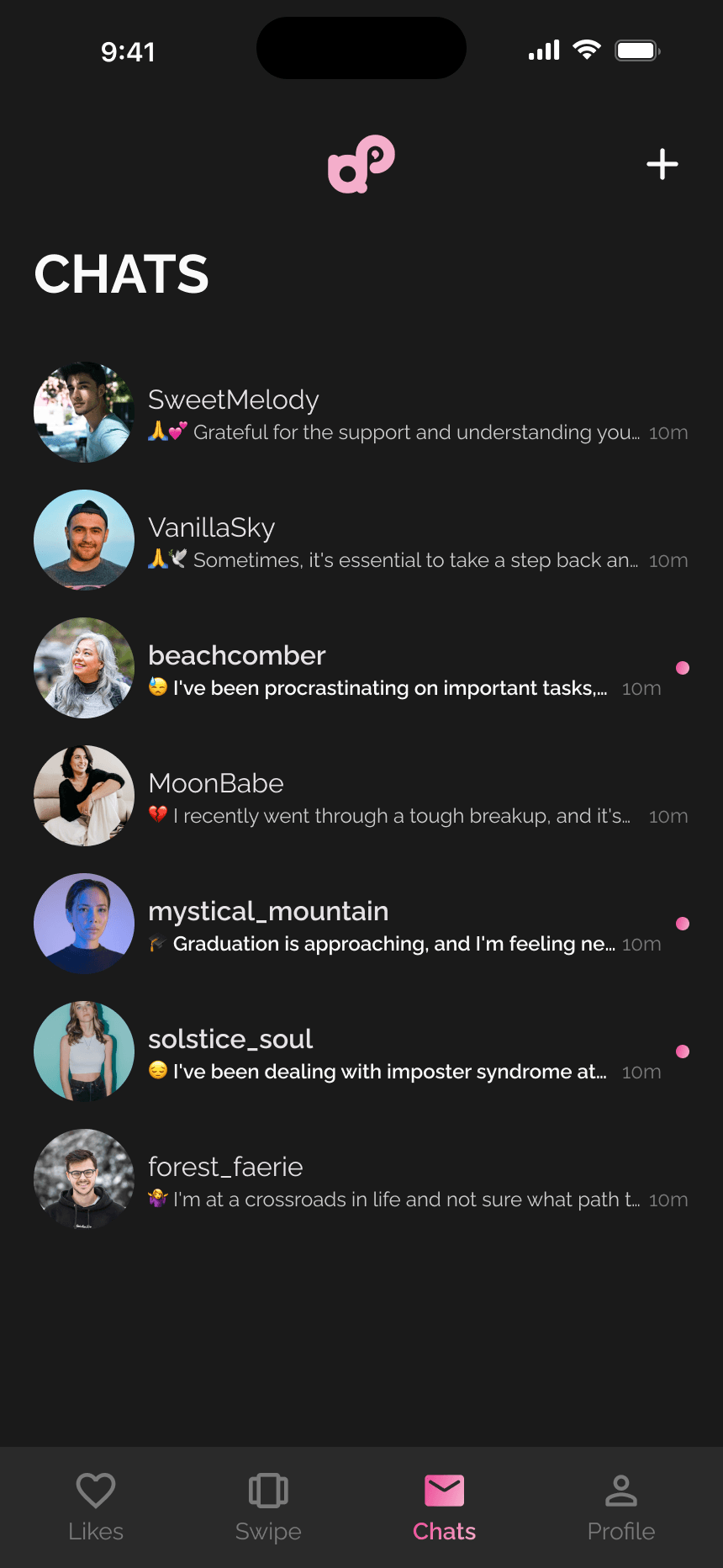
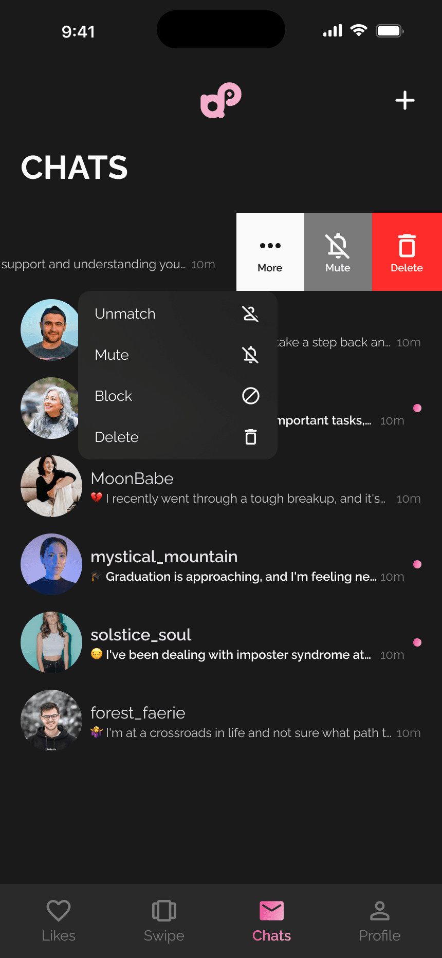
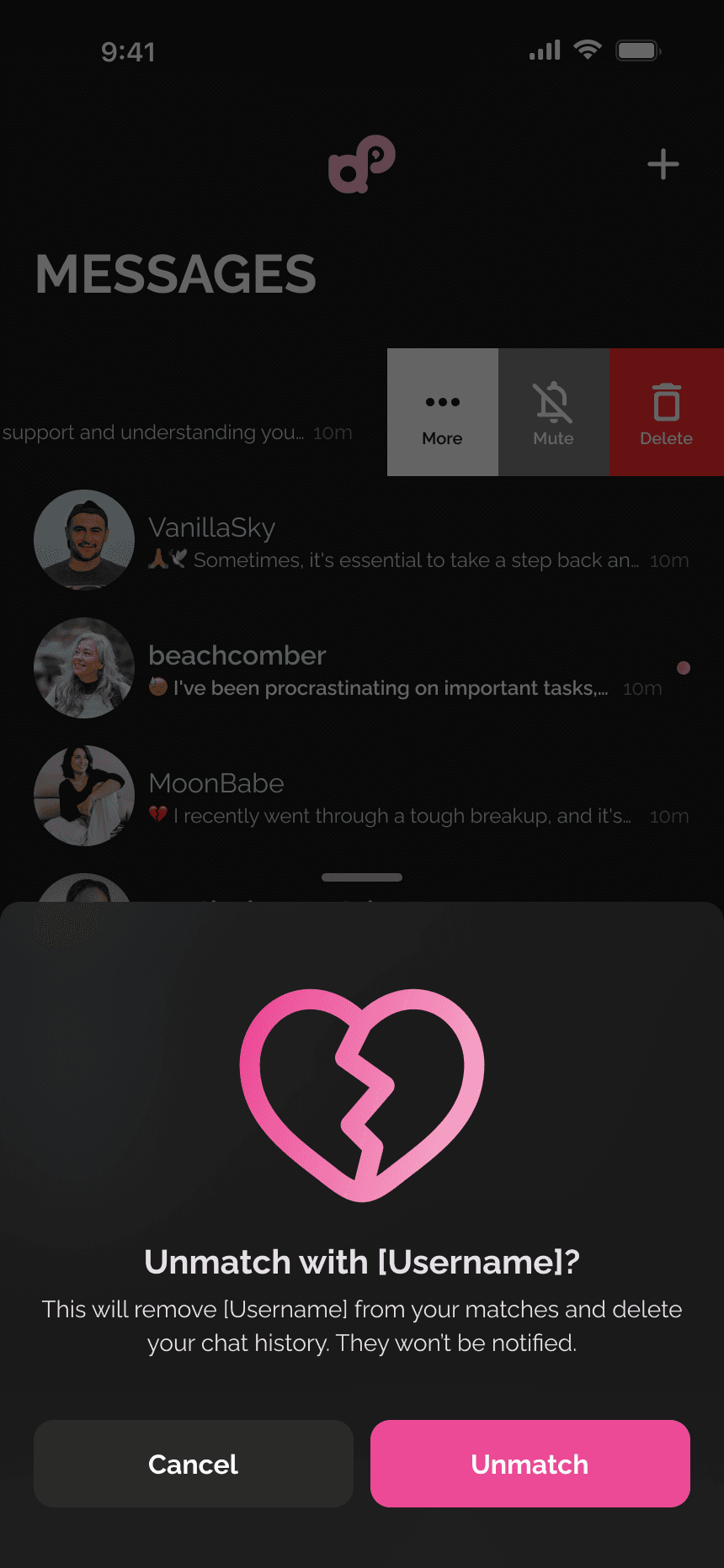
The messages tab shows all active conversations with profile photos, gamertags, and message previews. Users can swipe on a chat to reveal actions like mute, delete, or unmatch, each destructive action has a confirmation dialog with clear, empathetic copy.
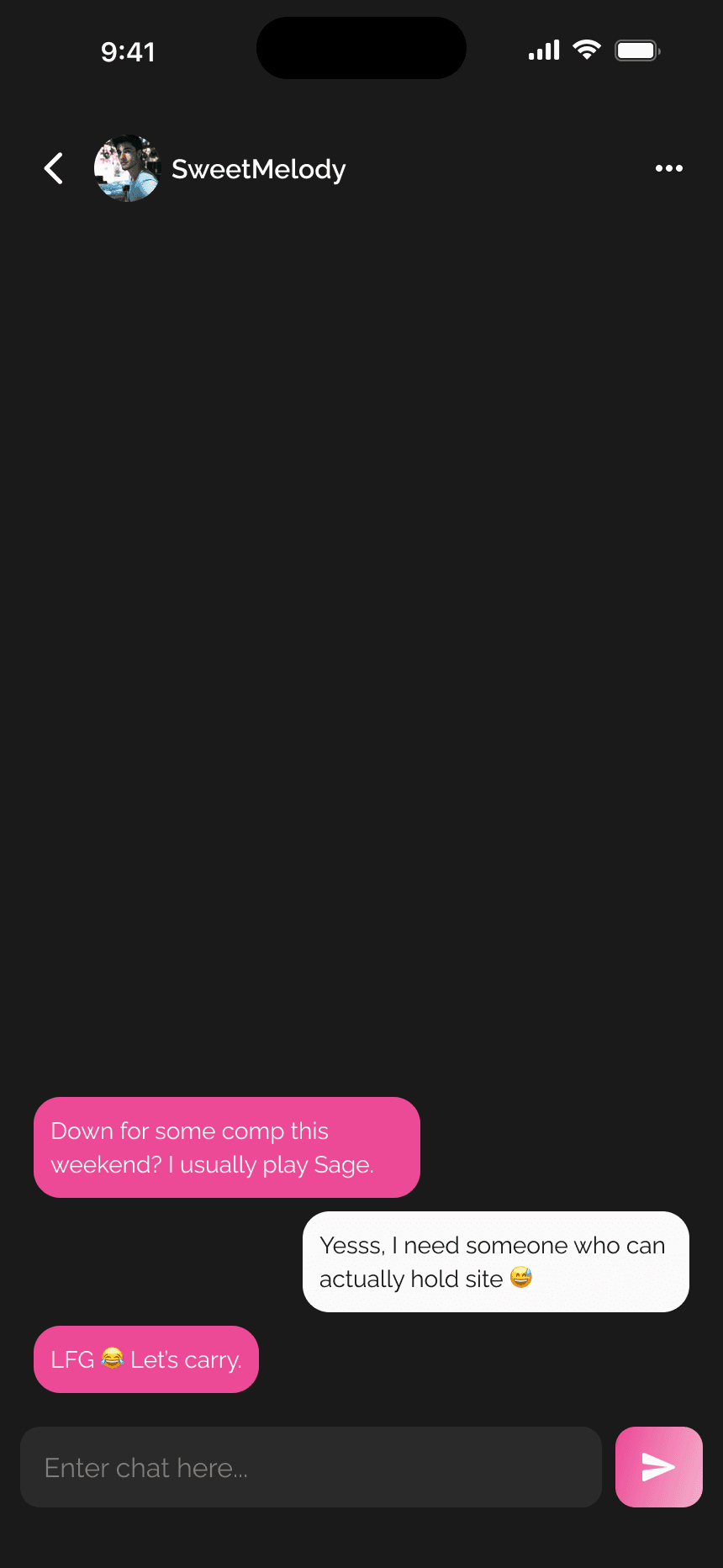
The unmatch and block flows were something I spent real time on. The unmatch confirmation shows a broken heart illustration with "Unmatch with [username]?", clear about what's happening without being dramatic. The block flow uses a "blocked" icon and explains the consequences. Trust and safety features are foundational for any social platform where strangers are connecting.
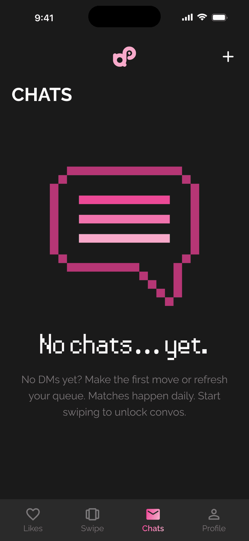
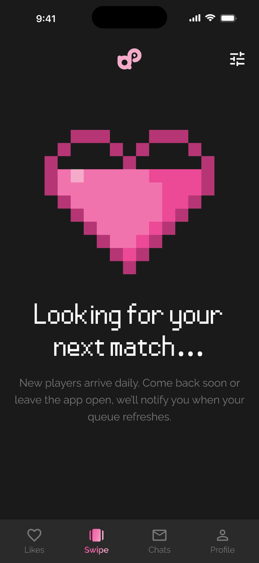
Every empty state in the app follows the same pattern: playful pixel-art illustration, short punchy headline, and a soft nudge toward the action that fills the screen. The empty messages state uses a pixel-art speech bubble with "No chats... yet." and encouragement to start swiping.
Preferences & Filters
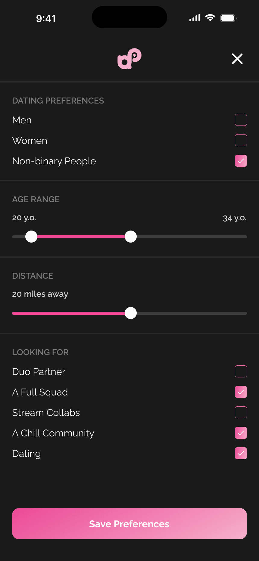
Accessible from a filter icon on the swipe screen, the preferences panel lets users fine-tune who they see: dating preferences, an age range slider, a distance slider, and a "looking for" checklist (duo partner, full squad, stream collabs, chill community, dating). Tucked away for power users but always one tap away, it gives control without cluttering the core swipe flow.
Visual Design
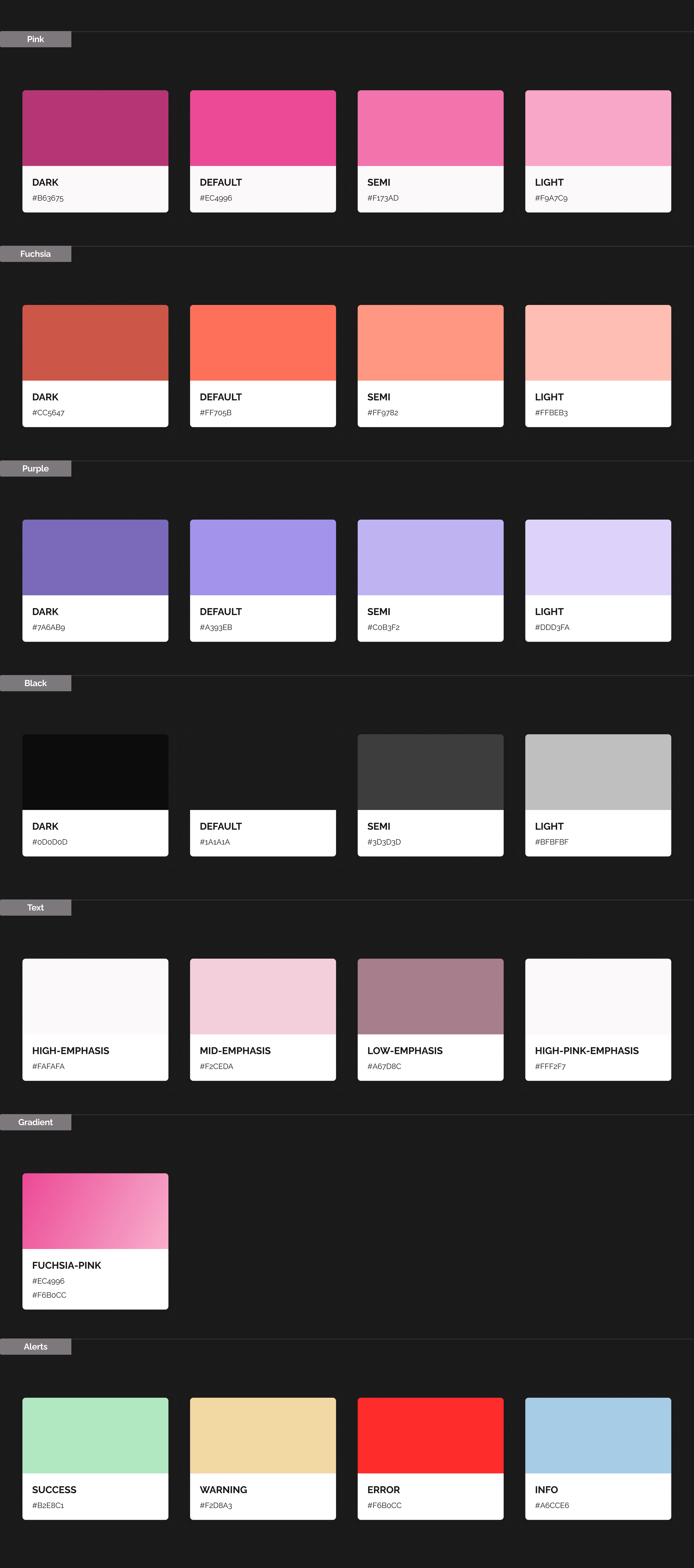
The brand palette, pink and black, was chosen to feel bold, playful, and gender-neutral. Pink in a gaming context subverts the typical dark-blue-and-neon aesthetic that dominates the space, making Queue Up feel fresh and approachable. The dark background keeps the UI comfortable for late-night gaming sessions, while pink accents draw attention to primary actions and the brand mark.
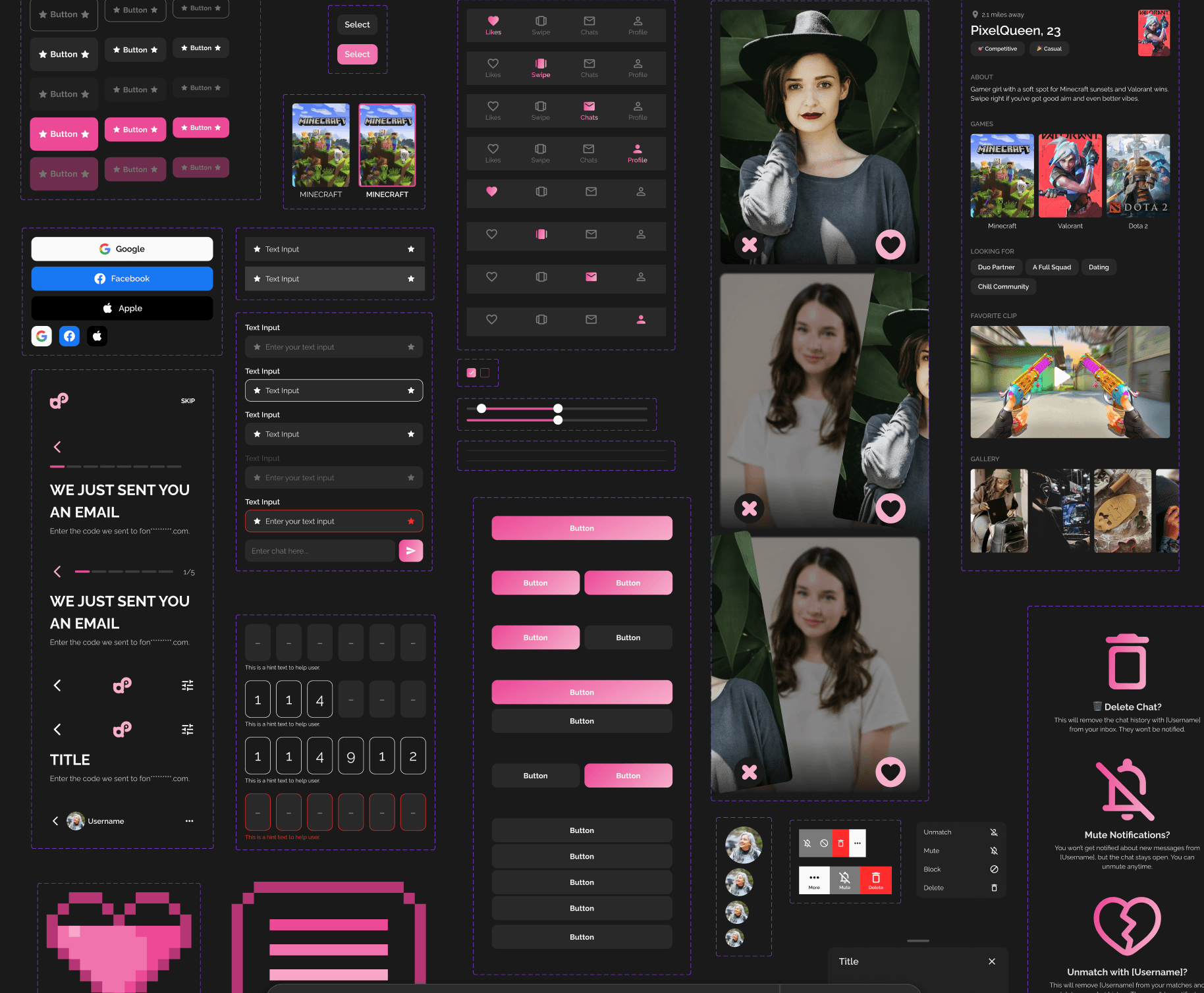
The pixel-art illustrations used across empty states add personality and reinforce the gaming identity without relying on any specific game's IP, a subtle nod to retro gaming culture that resonates across generations of gamers.
The Queue Up logo, the interlocking "qp" mark, reads as two players connecting, mirroring the product's core purpose.

What's Next
Queue Up is currently in hi-fi and moving into development. The product roadmap beyond MVP includes an online marketplace, chat forums for broader community discussion, and expansion into adjacent interest communities like anime, music, and pop culture, evolving Queue Up from a gamer-matching tool into a broader social discovery platform for niche interests.
Reflection
Wearing both the designer and CTO hats on this project created an unusual feedback loop: every design decision was immediately pressure-tested against technical feasibility, and every engineering constraint fed back into tighter design scoping. That dual perspective is what made a three-week timeline possible, there was no handoff friction because both sides lived in the same head.
If I could go back, I'd want to run usability tests on two things specifically: whether the gaming context comes through clearly enough in the swipe experience (does it feel like finding a teammate or finding a date?), and whether the eight-step onboarding is the right length or if users start dropping off midway. Those are the questions I'd validate before launch.